Analysis Studio
Analysis Studio is a core IBM Cognos BI component that is installed as part of the IBM Cognos BI Server install. It is a web-based, end-user analysis tool for business users and business analysts who need to analyze and explore the data to answer various business questions.
Analysis Studio uses dimensionally modeled data and the same administration processes and security that are already defined in the IBM Cognos BI environment. Analysis Studio, as the name suggests, is an analysis tool. It is a good fit for situations in which you want to discover relationships between data and then go further to find what contributes to your findings. For example, you can explore the data to find out the top-selling products. After you have that information, you can further your analysis by exploring the factors that contribute to their success and also use it to enhance the sales of other products.
LAUNCH ANALYSIS STUDIO
You can launch Analysis Studio from the Welcome screen by clicking Analyze my business or from the IBM Cognos Connection launch menu. Click Launch > Analysis Studio.
When you launch Analysis Studio, you must select a package that contains the metadata for your analysis, for example, Go Data Warehouse (analysis). Only dimensional packages will be available to you from here. You can work with one package at a time.
From the Analysis Studio Welcome window, you can choose to work with a Blank Analysis (default) or Default Analysis. When you choose Blank Analysis, a blank report opens up for you.
ANALYSIS STUDIO HIGH-LEVEL INTERFACE
Analysis Studio interface is easy to use and consists of the main areas shown in Figure 4.1 and described in the list that follows.
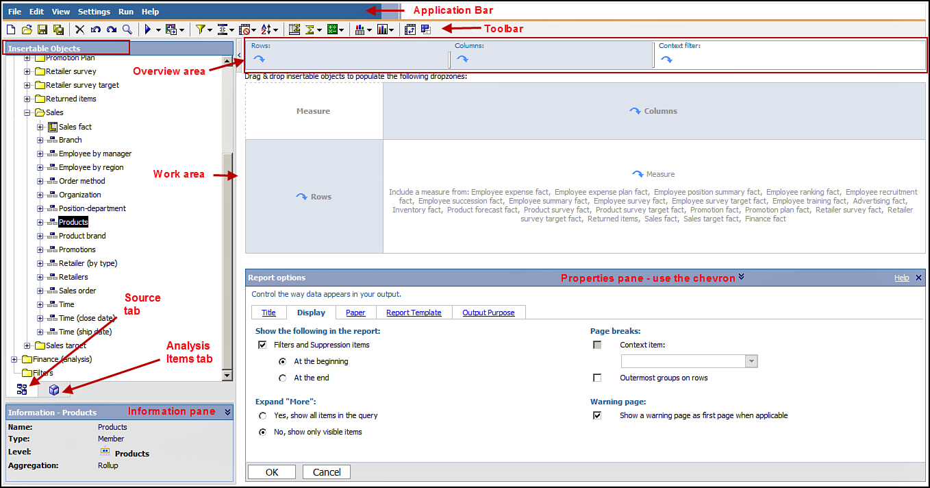 Figure 4.1. Analysis Studio – high-level interface.
1. Application Menu Bar: Displays the actions you can perform in Analysis Studio.
2. Toolbar: Provides icons for frequently accessed functions; some of the options are also available via the Application Menu.
3. Insertable Objects pane area: Has everything you need to build the analysis. It has two tabs: theSource tab and Analysis Items tab.
• Source tab: Displays all the items in the currently selected package that you can use to build the analysis. Because Analysis Studio uses dimensionally modeled data, you see the dimensional view of the data as dimensions, hierarchies, levels, and so on.
• Analysis Items tab: Displays items created in the analysis. It shows any saved custom sets and enables you to work with other saved analysis or custom sets.
• Information pane: Displays the name, type, level, and aggregation type, for example, Sum and so on for the selected item in the Source tab. Use the chevron to hide or show the Information pane. You can drag and drop the level shown in the information pane to the work area, if required.
4. Work area: Where you build your analysis. It has four drop zones, as shown in Figure 4.1. Drag and drop items from the Source tab to the drop zones, for example, Rows, Columns, and Measures. By default you always land on a blank work area when you create a new analysis.
5. Overview area: Enables you to explore the contents in the work area. It shows the filters and sorting options applied to the crosstab. It has three selections, for example, Rows, Columns, andContext. When you drag and drop items as rows and columns in the work area, the Overview areaRows and Columns values are automatically populated to reflect your selections. A Selection-based setalso appears at that time that enables you to work with the sets.
• Rows: Reflects the item you dropped in the Rows drop zone.
• Columns: Reflects the item you dropped in the Columns drop zone.
• Context filter: Enables you to focus your analysis on the values you want to work with. You can drag and drop one or more data items to the Context. When you drag and drop and item to the Context and select a value from the drop-down list, the data in the crosstab changes to reflect your selection.
6. Properties pane: Enables you to view the properties of the selected item in the Work area. Use the Properties pane to specify how to sort the data, hide and unhide data, and so on. The options displayed are context-sensitive depending on the currently selected item. You can show and hide the Properties pane via the chevron.
Figure 4.1. Analysis Studio – high-level interface.
1. Application Menu Bar: Displays the actions you can perform in Analysis Studio.
2. Toolbar: Provides icons for frequently accessed functions; some of the options are also available via the Application Menu.
3. Insertable Objects pane area: Has everything you need to build the analysis. It has two tabs: theSource tab and Analysis Items tab.
• Source tab: Displays all the items in the currently selected package that you can use to build the analysis. Because Analysis Studio uses dimensionally modeled data, you see the dimensional view of the data as dimensions, hierarchies, levels, and so on.
• Analysis Items tab: Displays items created in the analysis. It shows any saved custom sets and enables you to work with other saved analysis or custom sets.
• Information pane: Displays the name, type, level, and aggregation type, for example, Sum and so on for the selected item in the Source tab. Use the chevron to hide or show the Information pane. You can drag and drop the level shown in the information pane to the work area, if required.
4. Work area: Where you build your analysis. It has four drop zones, as shown in Figure 4.1. Drag and drop items from the Source tab to the drop zones, for example, Rows, Columns, and Measures. By default you always land on a blank work area when you create a new analysis.
5. Overview area: Enables you to explore the contents in the work area. It shows the filters and sorting options applied to the crosstab. It has three selections, for example, Rows, Columns, andContext. When you drag and drop items as rows and columns in the work area, the Overview areaRows and Columns values are automatically populated to reflect your selections. A Selection-based setalso appears at that time that enables you to work with the sets.
• Rows: Reflects the item you dropped in the Rows drop zone.
• Columns: Reflects the item you dropped in the Columns drop zone.
• Context filter: Enables you to focus your analysis on the values you want to work with. You can drag and drop one or more data items to the Context. When you drag and drop and item to the Context and select a value from the drop-down list, the data in the crosstab changes to reflect your selection.
6. Properties pane: Enables you to view the properties of the selected item in the Work area. Use the Properties pane to specify how to sort the data, hide and unhide data, and so on. The options displayed are context-sensitive depending on the currently selected item. You can show and hide the Properties pane via the chevron.
Application Menu
The Application menu contains different tasks that you can perform to create and manage analysis, as shown in Figure 4.1:
• The File option in the application bar has options that enable you to work with the analysis. You can use New to create a new analysis. You can choose from two new options: From the Default Analysis and Blank Crosstab. Create a new analysis (New), open an existing analysis (Open), open the analysis in Report Studio (Open with Report Studio), save the currently opened analysis (Save), save the currently opened analysis with a new name (Save As), and exit Analysis Studio (Exit).
• The Edit option in the application bar has six different options. Undo a change made with Undo, if you undo a change and want to revert it, use Redo; to remove an item use Delete. Hide enables you to hide rows and columns in the analysis; you can use Exclude to exclude selected items from the analysis; and Search (Last Selected Item) opens the Search window that enables you to search the immediate descendants of the selected item, which you can drag to the work area.
• View has seven options: Crosstab, Chart, Crosstab and Chart, Select Chart Type, Swap Rows and Columns, Objects and Information, Properties Pane.
• The Settings option in the application bar provides the following functionality: Suppress (has three suboptions: Remove All Suppression, Empty Cells Only, and Zeros and Empty Cells); Set Number of Visible Items; Data Format; Totals and Subtotals; Insertion Options (has two suboptions: Insert with Details and Insert Without Details); Show Welcome Dialog, and Get Data Later.
• The Run option on the application menu has the following options that enable you choose the report output types and set report options: Run Report (HTML), Run Report (PDF), Run Report (Excel 2007 Format), Run Report (Excel 2002 Format), Run Report (CSV), Run Report (XML), and Report Options. These options are discussed in section “Run Reports,” later in this chapter.
• Help has six different options. Help enables you to get additional help on Analysis Studio via the Analysis Studio User Guide; use the Contents option to access Analysis Studio product documentation for additional help; use the Quick Tour option to get a quick tour of IBM Cognos Connection (in Cognos v10.1 and earlier), IBM Cognos Query Studio, IBM Cognos Report Studio, IBM Cognos Analysis Studio, and IBM Cognos Event Studio; use Getting Started to get information on IBM Cognos Business Intelligence; use the option IBM Cognos on the Web to go to the IBM website; and use the option About IBM Cognos Analysis Studio to verify information such as the version of Analysis Studio you use.
Toolbar Options
The toolbar contains icons for frequently performed actions for easy access. Some of these options are also available via the application menu and are discussed there. Refer to Figure 4.1 to see the toolbar options.
• Search Data Item: Enables you to find the item in the Insertable Objects pane. The Search is limited to the immediate details of the selected item. You can then directly add the found item from theResults pane to the work area, for example, the crosstab or context area. You can also right-click an item in the Insertable Objects pane and choose Search.
• Run: Enables you to choose the report output type, for example, HTML, PDF, Excel, CSV, orXML.
• Go To: Enables you to invoke a related Cognos report for further analysis.
• Filter: Enables you to define a filter on the selected set in the analysis. You can combine filters to create complex filter conditions using the AND and OR operators.
• Top or Bottom: Enables you to display the Top or Bottom values in the analysis.
• Suppress: Enables you to suppress rows and columns with null or zero values in the analysis.
• Sort: Specifies sort options as ascending or descending. Use this to remove sorting via the No Sort option.
• Subtotals: Enables you to show and hide the subtotals that appear in the analysis.
• Summarize: Enables you to create summaries calculations for a selected set, for example, Sum,Average, Maximum, Minimum, Median, Variance, Standard Deviation, and Count.
• Calculate: Creates a calculation for one or more columns. Options available depend upon the number of rows (or columns) selected.
• Display: Switches the display to a Chart, Crosstab, and Chart or Crosstab (default).
• Chart Type: Enables you to choose a chart type appropriate for your analysis, for example, Column chart, Bar chart, Pie chart, Line chart, Pareto chart, Area chart, Radar chart, and Point chart.
• Swap Rows and Columns: Changes the existing rows in the analysis as column values and column as rows to get another perspective of the same data.
• Save as Custom Set: Saves a custom set that you may want to use frequently. The custom set is saved in the Analysis items tab in the Insertable Objects pane.
DIMENSIONAL DATA
Because Analysis Studio uses dimensional data only, a quick review of the topic is appropriate. Dimensionally modeled data is grouped into dimensions, hierarchies, levels, members, and measures. They enable you to answer questions such as When? What? Where? Who? and How?
Data in a dimensional model is grouped into the following:
• Dimensions: Represent a major aspect of the business, for example, Customers, Regions, and Products. It is the highest level of data in a dimensional model and is descriptive in nature.
• Hierarchies: Define a relationship between members in a dimension and determine the available navigation paths or ways to view data in the dimension. A dimension may have more than one hierarchy.
• Levels: Exist within hierarchies and provide detailed data in the dimension. There can be more than one level in a dimension. Each level down provides more detailed information about the dimension and has its own set of items that are seen as rows and columns in a crosstab report.
• Members: Are data items in the data source. A member can be a business key used to identify the data; it can be a caption used to present the data item; or it can be an attribute that provides additional information on the data item.
• Attributes: Are descriptive data about members in a level (which is not an identifier or caption).
• Measures: Are numeric values or metrics (Key Performance Indicators) used to determine business outcomes. They enable you to answer questions such as, how many or how much? There are two types of measures, that is, Regular and Calculated. Regular measures are numeric values available in the data source. Calculated measures are numeric values derived from other measures.
Set refers to a collection of related items in a single dimension. In Analysis Studio you typically work with Sets. Sets are discussed in detail in the section “Working with Sets,” later in this chapter.
DATA ANALYSIS TECHNIQUES
The following sections discuss several tools and techniques you can use to analyze your data.
Swap Rows and Columns
Swapping rows and columns is a common technique used to view the same data in another perspective. To swap the rows and columns in the analysis, use the Swap Rows and Columns icon in the Toolbar.
Replace Measures
You might want to replace the measure in the crosstab to view how other metrics are doing and assess the performance. Changing the value for the measure does not impact the row and column values.
You can replace the existing measure value in the crosstab with another value by dragging and dropping the new value on top of the existing value. Alternatively, you can right-click in the intersection (top-left edge of crosstab) and choose Change Default Measure > Select the newmeasure you want to display in the crosstab.
Sorting Rows or Columns
Analysis Studio retrieves data as it is stored in the data source and does not sort it by default. You can choose to display the data in your analysis by specifically telling Analysis Studio how to sort the data. You can sort items in ascending and descending order based on the value or a name.
Sort the data by clicking the row or column, and click the Sort option in the toolbar. The following options are available to you:
• No Sort, Sort by Labels (Ascending, Descending), Sort by Values (Ascending,Descending), and Custom..... If you choose Custom..., a sort window appears at the bottom of the screen with additional options to define the Sort Order and Options.
• Sort Order: Provides the following options No Sort, Ascending (1 to 9), Descending (9 to 1).
• Options: Provides the following as radio buttons to choose from: Based on the label, Based on the column (Default, all the columns currently displayed in the analysis), and By Measure (Default currently displayed measure in the analysis; you can choose another measure in the package), andBased on the attribute.
• To remove the sorting, choose the No Sort option from the Sort menu.
When working with nested sets, the values are sorted based on the innermost row or column value. To apply the sorting on a set using Custom sort, ensure that you have the set selected first.
Replace Row and Column Values
You might want to view the measure value in another perspective by changing the row values while keeping the column and measure values the same. You can replace the existing row values by dragging and dropping items from the Insertable Objects pane on the existing row value.
You can replace existing column values in the crosstab by dragging and dropping a new value from theInsertable Objects pane on the existing column value. This does not impact the existing row and measures in the analysis. To replace the selected item with its level, you can right-click the item in theInsertable Objects pane, and choose Replace with Level (currently selected item).
Nest Rows and Columns
You can broaden the perspective of your analysis by nesting rows and columns in the crosstab. These values can be from the same or different dimension depending on your requirement. When you nest rows or columns in the crosstab, you do that by dragging and dropping additional items onto the work area from the Insertable Objects pane. When nesting the rows you can drop the item from theInsertable Objects pane to the left or right of the existing row. You must take care to drop the items in the drop zones only, for example, when you see the three blinking lines. The nested row appears on the right of the current row, and a nested column appears below the current column. Figure 4.2 illustrates nested rows of Products within Organization and nested columns of months within a quarter.
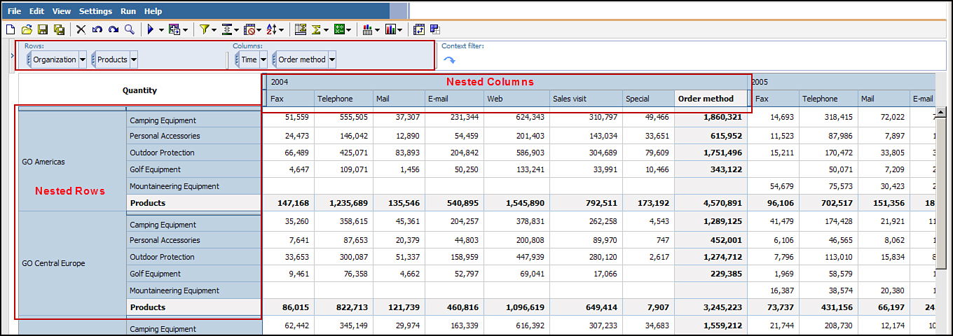 Figure 4.2. Nested rows and columns in a Crosstab report.
To nest columns, drag and drop items from the Insertable Objects pane above or below the existing column values. Again, ensure that before you drop the item that you see the three blinking lines indicating the drop zone. Alternatively, you can click the item in the Insertable Objects pane > selectInsert > select As Nested Rows or As Nested Columns, as per your requirement.
You can nest values from the same or different dimensions; however, the drill behaviors are different. The drill behavior is discussed later in the “Drill Down Option” and “Drill Up Option” sections.
You can nest multiple levels for both a row and column; however, too many levels of nesting actually make the analysis hard to follow. It is common to nest two or three levels for both rows and columns.
To remove a nested item, select the set in the work area > right-click > select Delete. Alternatively, in the Overview area (from Rows or Columns) > select Set > Delete.
Figure 4.2. Nested rows and columns in a Crosstab report.
To nest columns, drag and drop items from the Insertable Objects pane above or below the existing column values. Again, ensure that before you drop the item that you see the three blinking lines indicating the drop zone. Alternatively, you can click the item in the Insertable Objects pane > selectInsert > select As Nested Rows or As Nested Columns, as per your requirement.
You can nest values from the same or different dimensions; however, the drill behaviors are different. The drill behavior is discussed later in the “Drill Down Option” and “Drill Up Option” sections.
You can nest multiple levels for both a row and column; however, too many levels of nesting actually make the analysis hard to follow. It is common to nest two or three levels for both rows and columns.
To remove a nested item, select the set in the work area > right-click > select Delete. Alternatively, in the Overview area (from Rows or Columns) > select Set > Delete.
Switch the Nesting Sequence
You can change the nesting sequence in the analysis if the nesting uses items from different dimensions. You can switch the nesting sequence by simply dragging and dropping the item in the rows or columns, that is, one before the other, as shown in Figure 4.3.
 Figure 4.3. Change the nesting sequence.
Drill Down
The values in the analysis appear as a link when they are highlighted. This indicates that you can drill up and down on these items because they are dimensionally modeled. By default when you click the data item, it displays more detailed information. You can keep drilling down until you reach the leaf level. The number of levels available for you to drill down is guided by your requirements and is modeled in the data source. Alternatively, you can drill down by right-clicking the item and choosingDrill Down. The choices available are always context-sensitive, so if you don’t see the option you are looking for, ensure the appropriate item is selected in the analysis. You drill down by clicking the rows, columns, or the intersection.
If you want to drill down on the Set, you should select the Set via the set Selector for the row or column > right-click > Down a Level.
The Selector for the row or column appears in the Overview area. You can also click the Selector bar in the work area. The Selector bar for rows appears above the set and for columns on the left of the column. The Selector bar displays on the bar using a down arrow for row and a left arrow for the column. You can right-click the Selector bar for additional options.
Nested Values from Different Dimensions
When working with nested rows or columns from different dimensions, drilling down affects only the dimension you drill down on. For example, if you drill down on the nested (right row value) the parent column does not change, only the nested values drill down to a lower level. You can right click the nested row and select drill up to back up. Likewise, if you drill down on the outer row value, only the outer row value displays the lower levels, and the inner (right row nested values) will not change.Figure 4.4 illustrates that the Products dimension is nested within the Organization dimension. Clicking Products drills down the data in Products dimension only, and there is no change in the display for the Organization dimension.
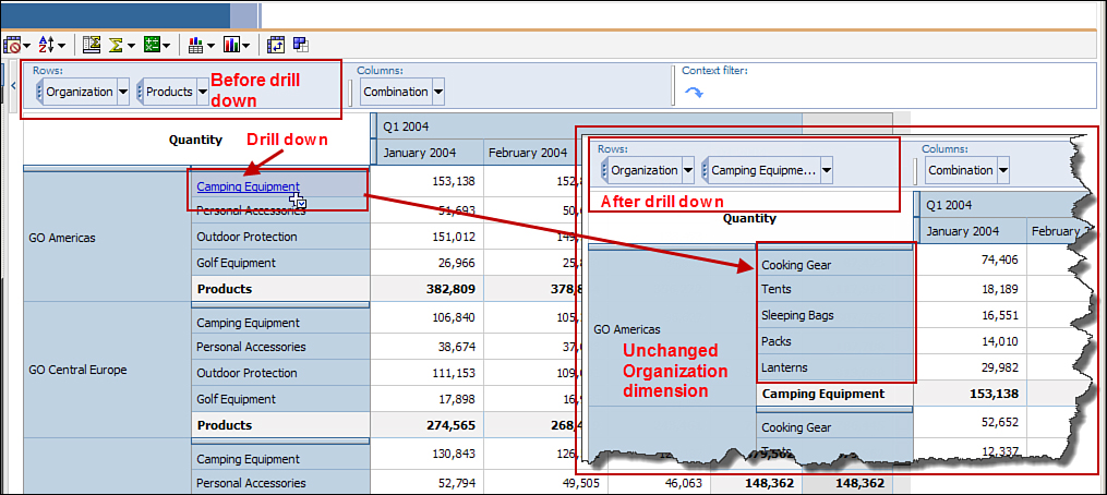 Figure 4.4. Drill down in a different dimension.
The steps to drill down on different dimensions are as follows:
1. In Cognos Connection, click Launch > Analysis Studio.
2. Select the package GO Data Warehouse (analysis).
3. Select Blank Analysis > click OK.
4. Expand the Sales and Marketing (analysis) folder.
5. Expand the Sales folder.
6. Right-click Organization > Insert > As Rows.
7. Right-click Time > Insert > As Columns.
8. Right-click Products > Insert > As Nested Rows.
9. Expand the Sales fact folder.
10. Drag and drop Revenue as Measures.
NOTE: In this case you can also right-click Revenue and choose Use as Default Measure to insert it as the measure.
11. Click Camping Equipment for GO Americas to drill down.
NOTE: Drill down displays the next lower level of Camping Equipment, for example, Cooking Gear,Tents, Sleeping Bags, Packs, and Lanterns display, whereas the GO Americas value for theOrganization has not changed.
Figure 4.4. Drill down in a different dimension.
The steps to drill down on different dimensions are as follows:
1. In Cognos Connection, click Launch > Analysis Studio.
2. Select the package GO Data Warehouse (analysis).
3. Select Blank Analysis > click OK.
4. Expand the Sales and Marketing (analysis) folder.
5. Expand the Sales folder.
6. Right-click Organization > Insert > As Rows.
7. Right-click Time > Insert > As Columns.
8. Right-click Products > Insert > As Nested Rows.
9. Expand the Sales fact folder.
10. Drag and drop Revenue as Measures.
NOTE: In this case you can also right-click Revenue and choose Use as Default Measure to insert it as the measure.
11. Click Camping Equipment for GO Americas to drill down.
NOTE: Drill down displays the next lower level of Camping Equipment, for example, Cooking Gear,Tents, Sleeping Bags, Packs, and Lanterns display, whereas the GO Americas value for theOrganization has not changed.
Nested Values from Same Dimension
When you nest items in the analysis that belong to the same dimension, drilling down changes the values for both (the parent and the nested values). Figure 4.5 illustrates that when you drill down on a quarter the data displayed in both the levels changes, for example, year is replaced by quarter and quarter by month.
 Figure 4.5. Drill down in the same dimension.
Drill Down Option
Use the Drill Down option to drill down to see a lower level of information. After you have drilled down to the leaf (lowest level) you cannot drill down any farther.
The steps to drill down in the same dimension are as follows:
1. Click the New icon in the toolbar to create a new analysis.
2. Using the GO Data Warehouse (analysis) package > expand the Sales and Marketing (analysis) folder.
3. Expand the Sales folder.
4. Right-click Organization > select Insert > As Rows.
5. Right-click Time > Insert > As Columns.
6. Right-click Products > select Insert > As Nested Rows.
7. Open the Sales fact folder.
8. Drag and drop Revenue as Measures.
9. Click the Set Selector arrow for Time (columns) > right-click and select Expand Time.
10. Click any quarter, for example, Q1 for any year.
NOTE: Now the top level is quarter Q12010 and the nested level is months January, February, andMarch for the year.
Drill Up Option
Use the Drill Up option to drill back up to see a higher level of information. After you have drilled up to the uppermost level, you cannot drill up any farther.
If you want to drill up on the Set, select the Set via the set Selector for the row or column > right-click > Up a Level.
Change the Display of Measures
By default when you drag and drop items onto the analysis as measures, they display as defined in the package, that is, Actual Values. However, you can choose to change the display to any of the following:
• %of Total in rows.
• %of Each Row Total displays how the row contributes to the total for the row.
• %of Total on Columns.
• %of Each Column Total displays how the column contributes to the total for the column.
• %of Overall Total displays how the crosstab contributes to the total for the crosstab.
To change the display from Actual Values to any of the other options, click the measure intersection (top-left corner of the crosstab) and right-click > select Show Values As > choose the display of your choice. If you want to display the values as in the package, right-click the measure corner (top left) > select Show Values As > Actual Values.
For user-defined calculations, first the arithmetic calculation is performed, and then the % of base calculation is applied.
For user-defined percentage calculation, there is no change when you choose to display the values as a percentage.
Work with Charts
Charts enable you to view the data in a graphical manner to easily identify the high and low data points. Charts are an ideal choice to reveal the trends and relationships in the data that may not be so obvious in a crosstab display. You can switch from one chart type to another by simply selecting another chart type from the Application menu > View > Chart Type > select the chart of your choice. Alternatively, you can choose an appropriate chart type from the Chart Type icon in the toolbar.
When working with charts you can still explore the data in the same way like you do in a crosstab, that is, drill up and down, swap rows and columns, sort, filter, and so on.
Analysis Studio has the following chart types you can choose from:
• Column Chart (Standard, Stacked, 100% Stacked, 3-D Axis, 3-D Visual Effect)
• Bar Chart (Standard, Stacked, 100% Stacked, 3-D Visual Effect)
• Pie Chart (Standard, Show Values as Percent, 3-D Visual Effect)
• Line Chart (Standard, Stacked, 100% Stacked, 3-D Axis, 3-D Visual Effect)
• Pareto Chart (Standard, 3-D Visual Effect)
• Area Chart (Standard, Stacked, 100% Stacked, 3-D Axis, 3-D Visual Effect)
• Radar Chart (Standard, Stacked)
• Point Chart
If you are new to charting, here are some tips to help you make a chart choice:
• Display contributions of a part to a whole: Pie Charts.
• Display trends in time or contrast values across different categories: Column, Bar, Line, Area, or Point.
• Compare groups of unrelated information against actual values: 3-D configuration chart type.
View Chart and Crosstab Together
To view crosstab and chart data at the same time, you can click the Chart Type icon in the toolbar and select the chart type you want. Doing this displays the chart on top and the crosstab report below the chart. You can change the chart type any time you want to another chart type that reveals it in a way that is more meaningful in your situation.
By default, the chart and the crosstab are synchronized, for example, when you click anywhere in the chart, the data in the crosstab changes and vice versa.
Depending on what you want, highlight Chart or Crosstab and increase or decrease the space allocated by dragging the line that divides the two.
Run Reports
When you are satisfied with the analysis you have created, you can run the report to see the generated data. You can choose the report output type, for example, HTML (default), PDF, Excel 2007 format, Excel 2002 format, CSV, and XML. HTML output displays all the data in the analysis. Consider using PDF output if you want to save the information in the analysis to share with others or save the snapshot of the data as of runtime.
In addition, you can specify the following options by selecting the Report Options via the Run Options... on the Application menu:
• Title: Enables you to provide a title and subtitle to the analysis.
• Display: Specifies if you want to hide or show the filter option (Filters and Suppression items), Expand More, Page breaks, and hide or show the Warning page.
• Paper: Enables you to choose the paper orientation as portrait or landscape (Orientation), choose the paper size, for example, A3, A4, Letter, Legal, and so on (Paper Size), and select if you want to shrink the content to fit the page width (Page scaling for PDF).
• Report Template: Enables you to choose an existing template in IBM Cognos BI environment; otherwise, it uses the default template.
• Output Purpose: Enables you to specify how the analysis will be used, for example, View as analysis or Use as interactive report (default). View as analysis provides you a snapshot of the analysis, that is, as it looked when it was saved.
The options you specify via Run Options... are applicable when you run the analysis, and the output, displays in Cognos Viewer.
Create Summary Calculations
You can create summary calculations that apply to an entire set. When you apply the summary calculation to the row or column, you can use a function such as Sum, Average, Maximum, Minimum,Median, Variance, Standard Deviation, Count, and Rollup.
To create a summary calculation, perform the following steps:
1. Click the set to summarize, for example, Retailers.
2. Click the Summarize icon in the toolbar > Maximum(Retailers).
NOTE: Examine an additional row that has been added that satisfies the criteria, for example, maximum(retailers).
Create Item-Based Calculations
You can also create a calculation based on existing values in the package. Calculations are evaluated each time you work with the analysis based on the data available in the data source at that time; the results are not stored. If you want to save a snapshot of the values at any point in time, you should run the analysis as a PDF and save it for later use.
After you have created a calculation, you cannot edit it; you must delete and re-create the calculations.
Select the columns or rows you want to use to create the calculation, and click Calculate on the toolbar. Figure 4.6 illustrates steps to create an item-based calculation.
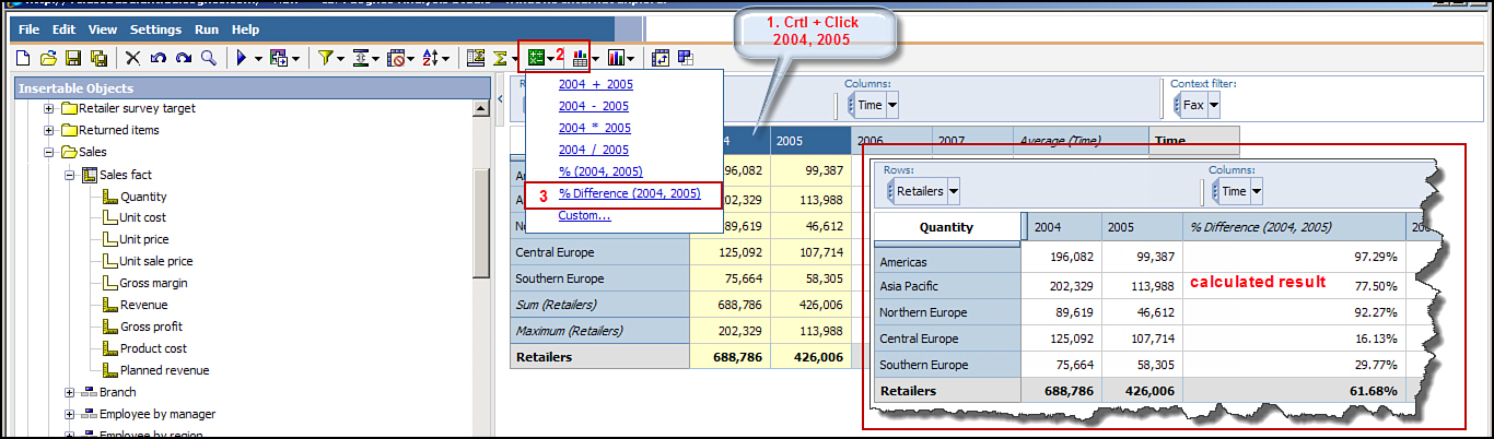 Figure 4.6. Create item-based calculation.
To create an item-based calculation, perform the following steps:
1. Click the New icon in the toolbar to create a new analysis.
NOTE: This exercise uses the package GO Data Warehouse (analysis).
2. Right-click Retailers > select Insert > As Rows.
3. Right-click Time > select Insert > As Columns.
4. From the Sales fact folder, drag and drop Quantity as Measure.
5. Ctrl+click 2004, 2005 > click Calculate > %Difference(2004,2005).
NOTE: A new column, %Difference(2004,2005), is added to the analysis.
Figure 4.6. Create item-based calculation.
To create an item-based calculation, perform the following steps:
1. Click the New icon in the toolbar to create a new analysis.
NOTE: This exercise uses the package GO Data Warehouse (analysis).
2. Right-click Retailers > select Insert > As Rows.
3. Right-click Time > select Insert > As Columns.
4. From the Sales fact folder, drag and drop Quantity as Measure.
5. Ctrl+click 2004, 2005 > click Calculate > %Difference(2004,2005).
NOTE: A new column, %Difference(2004,2005), is added to the analysis.
WORKING WITH SETS
Set refers to a collection of related items in a single dimension. In Analysis Studio, you typically work with Sets. When you drag and drop an item to the work area (Products, for example), you create a detail set. Detail set means that a row is created for each detail item.
Detail-Based Set
In the detail set, when you drag and drop an item from the Insertable Objects pane to the work area, its child entries automatically are selected and become part of the analysis. This enables you to drill down and drill up on the item. This is the default behavior.
Custom Sets
Custom Sets enable you to select the items you to want to work with and save them for reuse later, as illustrated in Figure 4.7. If you have to pick selected items each time for the rows or columns, you can choose to create a Custom Set for those items. When you create the custom set, the set displays in theAnalysis Items tab in the Insertable Objects pane.
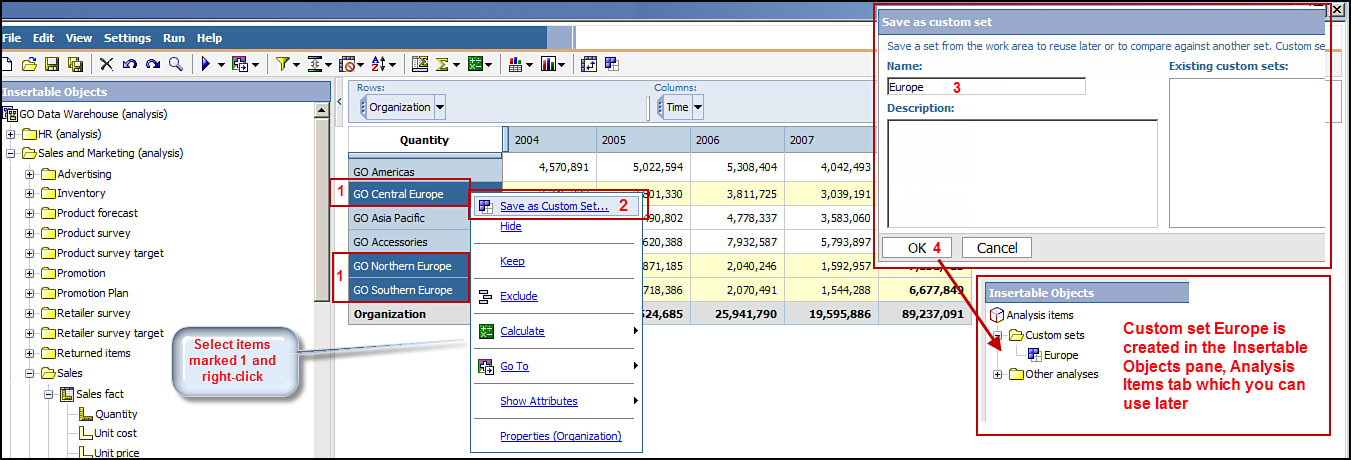 Figure 4.7. Create a custom set.
To create a custom set, perform the following tasks:
1. Click the New icon in the toolbar to create a new analysis.
2. If not already selected, choose GO Data Warehouse (analysis) package.
3. From the Insertable Objects pane, drag and drop GO Data Warehouse (analysis) > Sales and Marketing (analysis) > Sales > Organization as Rows.
4. Drag and drop Time as Columns.
5. Drag and drop Quantity as Measure.
6. Ctrl+click values GO Central Europe, GO Northern Europe, and GO Southern Europe, as shown in Figure 4.7.
7. Right-click and select Save as Custom Set.
8. In the Save as custom set window, type Europe in the Name box.
NOTE: Examine the box for Existing custom sets.
9. Click OK.
10. In the Insertable Objects pane, on the Analysis Items tab, the new custom set you created, for example, Europe, displays under the Custom sets folder.
NOTE: You can now drag and drop Europe in the work area anytime you want to work with GO Central Europe, GO Southern Europe, and GO Northern Europe.
Figure 4.7. Create a custom set.
To create a custom set, perform the following tasks:
1. Click the New icon in the toolbar to create a new analysis.
2. If not already selected, choose GO Data Warehouse (analysis) package.
3. From the Insertable Objects pane, drag and drop GO Data Warehouse (analysis) > Sales and Marketing (analysis) > Sales > Organization as Rows.
4. Drag and drop Time as Columns.
5. Drag and drop Quantity as Measure.
6. Ctrl+click values GO Central Europe, GO Northern Europe, and GO Southern Europe, as shown in Figure 4.7.
7. Right-click and select Save as Custom Set.
8. In the Save as custom set window, type Europe in the Name box.
NOTE: Examine the box for Existing custom sets.
9. Click OK.
10. In the Insertable Objects pane, on the Analysis Items tab, the new custom set you created, for example, Europe, displays under the Custom sets folder.
NOTE: You can now drag and drop Europe in the work area anytime you want to work with GO Central Europe, GO Southern Europe, and GO Northern Europe.
Selection-Based Set
A Selection-based set enables you to pick certain items that you want to display in the analysis explicitly from one or more levels in the same hierarchy. When you add these to the crosstab in the work area, these items are added to the analysis without their lower level details.
After creating a Selection-based set, you can Ctrl+click items that you want to work with from one or more levels within the same dimension. For example, from the Products dimension instead of working with all the values such as Camping Equipment, Mountaineering Equipment, Personal Accessories, Outdoor Protection, and Golf Equipment, you can Ctrl+click only the items with which you want to work such as Camping Equipment and Golf Equipment.
To create a Selection-based set, perform the following steps:
1. Click the New icon in the toolbar to create a new analysis, using the GO Data Warehouse (analysis) package.
2. In the Insertable Objects pane, expand Retailers > Ctrl+click Americas and Asia Pacific > drag and drop as Rows.
NOTE: You created a selection-based set in your analysis by selecting only certain items from the set.
3. To complete creating the analysis, right-click Time > select Insert > As Columns.
4. Drag and drop Quantity as Measure.
APPLY FILTERS
Filters enable you to display only the data that you require in the report. Analysis Studio provides two types of filters:
• Item Filters: Enable you to limit the items displayed in the rows and columns of the analysis. Item filters are commonly used to display top or bottom values, exclude items from the analysis, and so on.
• Context filters: Display the data in the analysis in the context of data items meaningful to your business. You can have more than one context filter. When you apply a context filter to your analysis, only the context of the data changes; it does not change the layout of the analysis, that is, the rows and the columns.
Steps to Apply Context Filters
To apply a context filter, perform the following steps:
1. Click the New icon in the toolbar to create a new analysis.
2. Right-click Organization > select Insert > As Rows.
3. Right-click Time > select Insert > As Columns.
4. Drag and drop Quantity as Measure.
5. Drag and drop the Order Method to the Context Filter area.
6. Click the Order Method drop-down > select Fax.
NOTE: The data in the analysis is now only for the Fax order method, and the summaries have changed.
7. Drag and drop Products to the right of Order Method.
8. Using Products filter, select Camping Equipment.
NOTE: The summaries have changed again; now data in the analysis is only reflective of Camping Equipment and Fax, and the context area serves to remind you how the report is filtered.
Item filters are discussed in detail in the following sections. Each of these filters is applied based on an item in your analysis.
Exclude
You can remove rows and columns that you do not want to use in the analysis. Unlike items that have the Hide option applied (discussed in the next section), excluded items do not contribute to the summaries in the analysis.
To exclude items, perform the following steps:
1. Click the rows/columns to exclude from the analysis.
2. Click Edit in the menu bar > select Exclude.
NOTE: Alternatively, you can select the item to exclude > right-click > select Exclude.
Hide Rows and Columns
You can hide rows and columns that you do not want to display in your analysis. When you hide a row or column, the summaries of the hidden row or column are still included in the report in More & hidden as well as the summary. The Hide option cannot be used for Selection-based sets.
To hide/unhide rows/columns, perform the following steps:
1. Click the Row (or Column) you want to hide.
2. Right-click > select Hide.
NOTE: Now a new row (or column) is added to the analysis More & hidden.
3. Click the More & hidden row (or column) > right-click > select Unhide option for the value you want to unhide.
NOTE: Alternatively, you can also hide from the Application menu; select an item to hide > Edit >Hide.
Keep
The Keep option enables you to specify which items you want to display in the report. Select the items you want to keep > right-click > select Keep.
Keep enables you to display in the report only the values you have chosen to keep with a single summary line. For example, the Keep option can be used instead of Exclude, if you want to exclude some rows or columns from your analysis and display in the analysis only those rows and columns that are not excluded, and their total, that is, the excluded rows or columns will not display in your analysis.
You can also use Keep when working with Selection-based sets.
Rank
Ranking enables you to compare performance based on the item that is meaningful to your business. Use the Rank option to identify the relative position. By default, ranking is applied based on the innermost nested set; if you want to rank in a different way use Custom Ranking. In addition, it is context-sensitive; the options available depend upon if you have selected a single item or a set.
To rank items in a set, perform the following steps:
1. Right-click Row (or Column) to rank.
2. In the toolbar, click Calculate > Rank.
NOTE: Alternatively, you can select the item or set and right-click > select Calculate > Custom. This opens the Calculate window. From here you can specify the operation type as Ranking and the Operation as Rank. You can specify the measure you want to rank, define an expression, and give it a meaningful name.
Hold Current Context
Hold Current Context enables you work with the existing context, for example, sorting, filters, and ranking when you change the context. By default when you change the context of your analysis, the values displayed in the analysis for the selected set also changes, as shown in Figure 4.8.
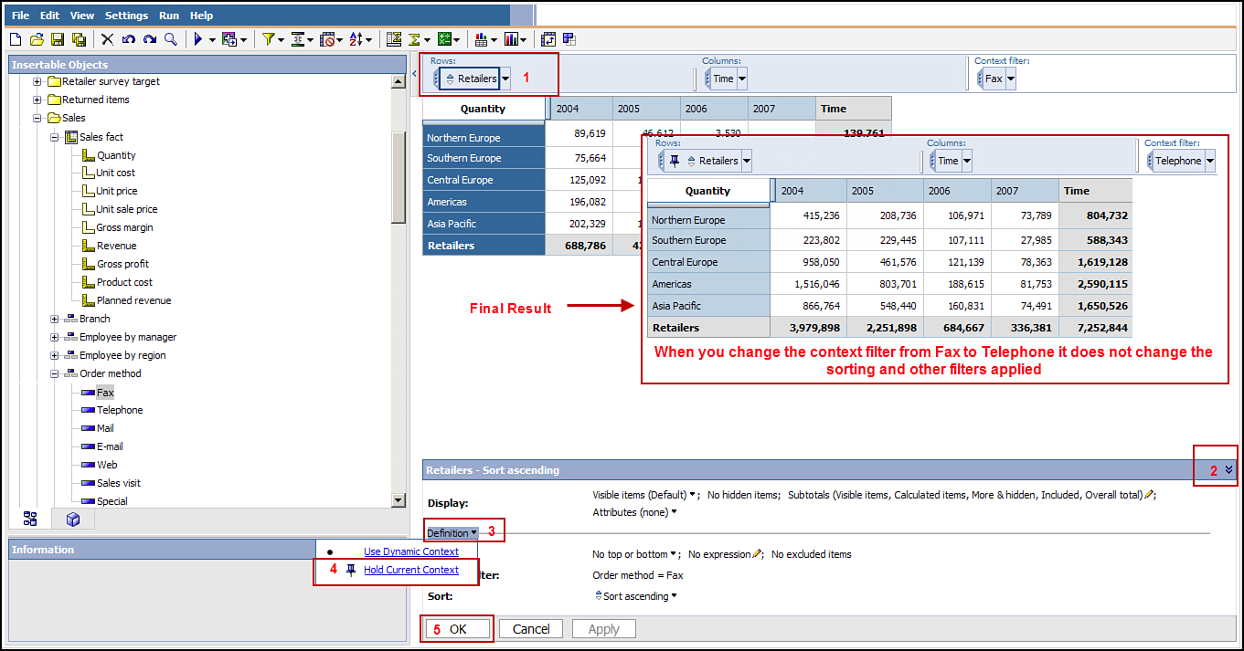 Figure 4.8. Hold the current context in the analysis.
To hold the current context, perform the following steps:
1. Click the New icon in the toolbar to create a new analysis.
NOTE: If not already open, launch Analysis Studio, and select the package GO Data Warehouse (analysis).
2. Right-click Retailers > select Insert > As Rows.
3. Right-click Time > select Insert > As Columns.
4. Drag and drop Quantity as Measure.
5. Drag and drop Fax to the Context Filter area.
NOTE: There are six retailers listed currently.
6. Select the Retailers set > from the toolbar, select Top or Bottom > Top 5.
NOTE: Only five retailers are listed in the analysis now.
7. Click Retailers in the Overview area > click the Properties chevron to expand it> click onDefintion (drop down) > select Hold Current Context.
8. Click OK.
9. Drag and drop from Order Method > Telephone and change the context filter.
NOTE: The context for the analysis still holds with the Top 5 option applied; only the values in the analysis changed to reflect the newly applied context filter.
Figure 4.8. Hold the current context in the analysis.
To hold the current context, perform the following steps:
1. Click the New icon in the toolbar to create a new analysis.
NOTE: If not already open, launch Analysis Studio, and select the package GO Data Warehouse (analysis).
2. Right-click Retailers > select Insert > As Rows.
3. Right-click Time > select Insert > As Columns.
4. Drag and drop Quantity as Measure.
5. Drag and drop Fax to the Context Filter area.
NOTE: There are six retailers listed currently.
6. Select the Retailers set > from the toolbar, select Top or Bottom > Top 5.
NOTE: Only five retailers are listed in the analysis now.
7. Click Retailers in the Overview area > click the Properties chevron to expand it> click onDefintion (drop down) > select Hold Current Context.
8. Click OK.
9. Drag and drop from Order Method > Telephone and change the context filter.
NOTE: The context for the analysis still holds with the Top 5 option applied; only the values in the analysis changed to reflect the newly applied context filter.
Top or Bottom
Top or Bottom values enable you to focus your analysis on the Top performing or Bottom performing sets in the analysis, as shown in Figure 4.9. You can choose from the three default options: No Top or Bottom, Top, and Bottom. You can also either pick from the default of 5, 10, 20 to display 5, 10, or 20 top or bottom values; otherwise use the Custom link to specify your top or bottom requirement. The top or bottom options apply to a set, so you must first select the set that you want to apply the top or bottom rule to. The Top or Bottom rule is applicable only to the set that is currently in the analysis. Sets that were excluded via the filter are not included in the Top or Bottom rule. When you change the context in the Overview area, the values in the analysis also change. If you want the filter rules to be ignored when the context changes, you can use the Hold the Current Context option (discussed earlier).
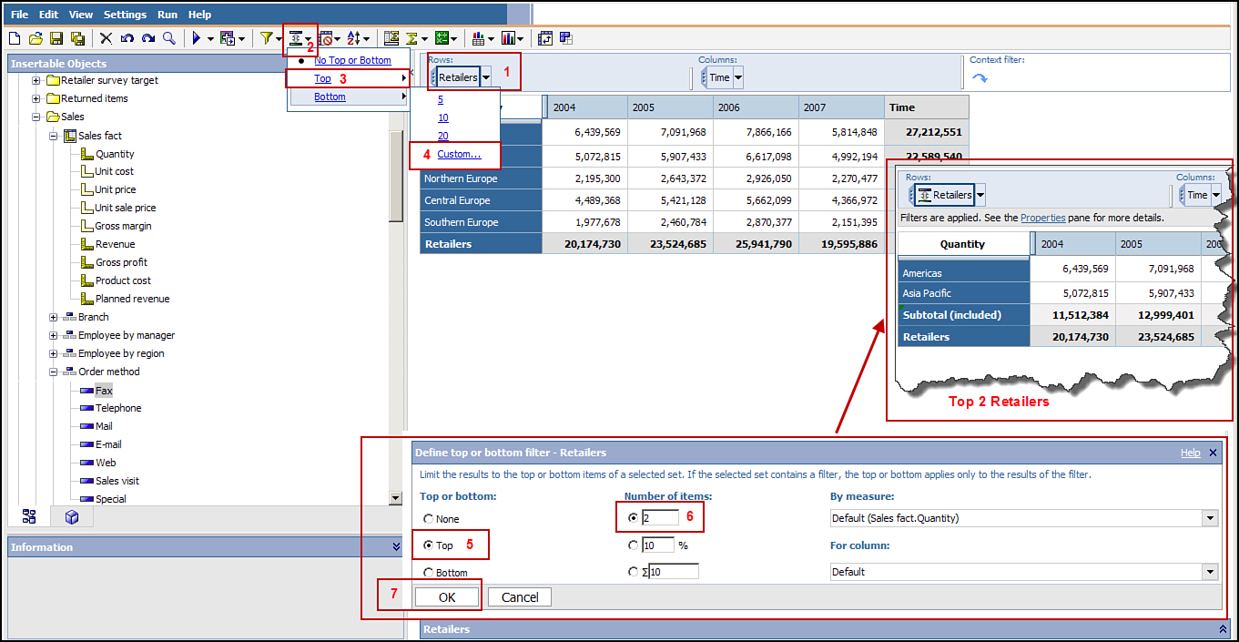 Figure 4.9. Display Top or Bottom values in the analysis.
To define Top or Bottom, perform the following steps:
1. Click the New icon in the toolbar to create a new analysis.
2. Right-click Retailers > select Insert > As Rows.
3. Right-click Time > select Insert > As Columns.
4. Drag and drop Quantity as Measure.
5. Right-click Retailers > click Top or Bottom icon in the toolbar > select Top > select Custom...> in the Number of items box type 2 > click OK.
NOTE: Data in the analysis is now only for the top two items. An additional subtotal line is included for only the items currently displayed in the analysis as well as the overall total for all retailers.
Figure 4.9. Display Top or Bottom values in the analysis.
To define Top or Bottom, perform the following steps:
1. Click the New icon in the toolbar to create a new analysis.
2. Right-click Retailers > select Insert > As Rows.
3. Right-click Time > select Insert > As Columns.
4. Drag and drop Quantity as Measure.
5. Right-click Retailers > click Top or Bottom icon in the toolbar > select Top > select Custom...> in the Number of items box type 2 > click OK.
NOTE: Data in the analysis is now only for the top two items. An additional subtotal line is included for only the items currently displayed in the analysis as well as the overall total for all retailers.
Suppress
You can use the Suppress option to hide rows with null or zero values in your analysis. The Suppressoption works when both the row and column value is zero. You can choose from any of the following options:
• No General Suppression on Rows or Columns
• Suppress Rows and Columns
• Suppress Rows Only
• Suppress Columns Only
• Suppress Rows or Columns of Selection
• Custom
NOTE: Custom enables you to suppress rows or columns with zero or null values in the selected set.
Figure 4.10 shows that using the suppression feature rows with null values, for example, Unspecified 2004 and Unspecified 2005, are removed from the analysis.
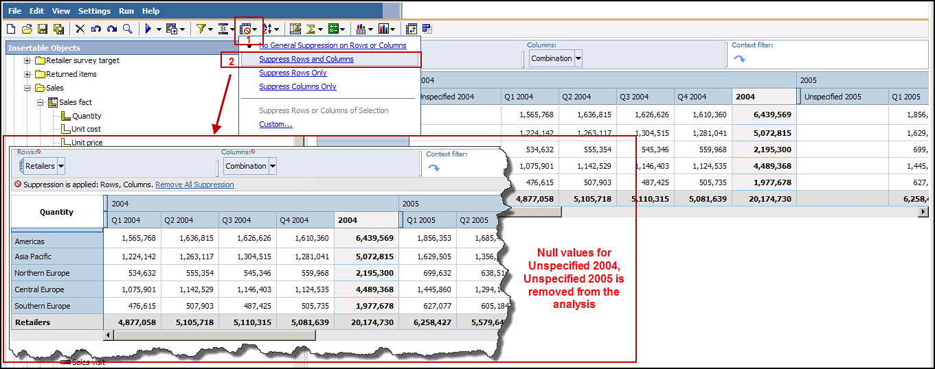 Figure 4.10. Suppress rows and columns in the analysis.
To suppress rows and columns in the analysis, perform the following steps:
1. Click the New icon in the toolbar to create a new analysis.
2. Right-click Retailers > select Insert > As Rows.
3. Right-click Time > select Insert > As Columns.
4. Drag and drop Quantity as Measure.
5. Right-click Time in the Overview Filter area > Right-click > select Expand Time.
6. Click Suppress in the toolbar > select Suppress Rows and Columns.
NOTE: The null values are removed from the analysis.
Figure 4.10. Suppress rows and columns in the analysis.
To suppress rows and columns in the analysis, perform the following steps:
1. Click the New icon in the toolbar to create a new analysis.
2. Right-click Retailers > select Insert > As Rows.
3. Right-click Time > select Insert > As Columns.
4. Drag and drop Quantity as Measure.
5. Right-click Time in the Overview Filter area > Right-click > select Expand Time.
6. Click Suppress in the toolbar > select Suppress Rows and Columns.
NOTE: The null values are removed from the analysis.
Working with Subtotals
Subtotals summarize the data in the analysis. When you apply filters such as Exclude or Hide data in the analysis, an additional summary row or column is added to the analysis. You can show the subtotals you need in the analysis and hide the rest.
To hide the subtotal, perform the following steps:
1. Select the set.
2. Click the Subtotals icon in the toolbar.
3. In the Subtotals window select the check boxes for subtotals you want to show, or uncheck the ones you want to hide.
When working with the crosstab, you can have the following types of subtotals:
• Subtotal: The sum of visible items in the analysis.
• More and More & hidden: Displays the values of the remaining items. If you hide any items in the analysis, More changes to More & Hidden.
• Subtotal (included): Displays the total (or aggregate) of all items that satisfy the filter rules.
• Subtotal (excluded): Displays the values excluded from the Subtotal (included), that is, those that do not satisfy the filter rules.
• Summary or Total: Displays the overall (grand) total of all the subtotals (mentioned here). In Selection-based sets, this appears as Total.
User-Defined Filter
You can create a filter to focus on only the data relevant for your analysis as outlined in the steps that follow:
1. Click the New icon in the toolbar to create a new analysis.
2. Right-click Retailers > select Insert > As Rows.
3. Right-click Time > select Insert > As Columns.
4. Drag and drop Quantity as Measure.
5. Click Retailers to select the set.
6. On the toolbar, click the Filter icon > select Custom.
7. In the Filter window, click the link Add a filter line.
8. In the Value column, type in 21,000000 or any other value appropriate in your situation.
NOTE: You can click Add a filter line, Delete, or Delete all link to add or delete filters in the Filter window. In addition, you can specify the AND or OR condition by selecting from the available radio buttons, for example, All criteria must be met (AND) or At least one of the criteria must be met (OR).
9. Click the Save button.
Combine User-Defined Filter
You can combine the filters to create complex filter conditions using AND and OR operators. For mandatory rules, use the AND operator in the filter, and for optional rules use the OR operator.
Figure 4.11 shows how to combine filters to create complex filter conditions.
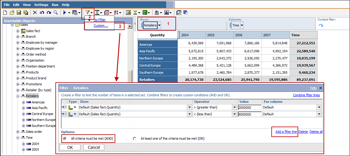 Figure 4.11. Combine filters in the analysis.
To combine user-defined filters, perform the following steps:
1. Click the New icon in the toolbar to create a new analysis.
2. Right-click Retailers > select Insert > As Rows.
3. Right-click Time > select Insert > As Columns.
4. Drag and drop Quantity as Measure.
5. Click the Retailers to select the set > click the Filter icon in the toolbar > select Custom.
6. In the Filters window, click the link Add a filter line > type 2000000.
7. Click the Add a filter line link > change the Operator to an angle bracket (>) and type 9000000in the Value column > choose the appropriate operator in the Options section.
NOTE: Examine the For columns option in the Filter window. The filter applied is contextual and can be applied to a row or column. The value of Default means that the rollup is at the highest level. You can change this selection using another value from the drop-down list.
8. Click OK.
Figure 4.11. Combine filters in the analysis.
To combine user-defined filters, perform the following steps:
1. Click the New icon in the toolbar to create a new analysis.
2. Right-click Retailers > select Insert > As Rows.
3. Right-click Time > select Insert > As Columns.
4. Drag and drop Quantity as Measure.
5. Click the Retailers to select the set > click the Filter icon in the toolbar > select Custom.
6. In the Filters window, click the link Add a filter line > type 2000000.
7. Click the Add a filter line link > change the Operator to an angle bracket (>) and type 9000000in the Value column > choose the appropriate operator in the Options section.
NOTE: Examine the For columns option in the Filter window. The filter applied is contextual and can be applied to a row or column. The value of Default means that the rollup is at the highest level. You can change this selection using another value from the drop-down list.
8. Click OK.
DRILL-THROUGH
Drill-Through reports are prebuilt by report authors for you or can be authored via Cognos Connection, that is, the package-based drill through. You can access these reports only if you have been given permissions to access them.
The Drill-Through option enables you to access related reports with data to support your analysis. Because Analysis Studio represents summarized values in the analysis, this option enables you to access related reports with details that build the summaries in the analysis. You can access an Analysis Studio analysis, Report Studio report, Cognos Series 7 PowerCube, and Query Studio query as the target Go To report.
You can select the row or column and then choose the Go To link in the toolbar to choose the related report. If there are no related reports, the Available Links section in the Go to window will be empty. Alternatively, to retain the context of the context filter, right-click the context filter > selectUse as the Go To parameter.
WORKING WITH CROSSTABS
You can create advanced reports that enable you to compare two or more sets of data in the same crosstab report. Some of the options available to you are creating stacked crosstabs or asymmetric crosstabs as detailed in the sections that follow.
Stacked Crosstabs (Union Set)
Stacked crosstabs, as the name suggests, has two or more crosstabs stacked one above the other (shown in Figure 4.12) or side-by-side (shown in Figure 4.13).
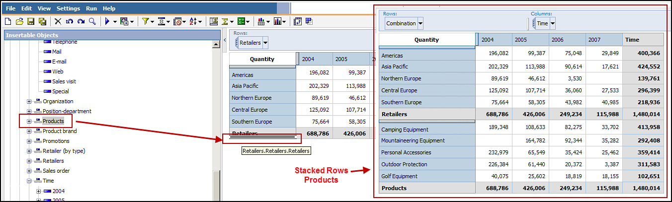 Figure 4.12. Working with a stacked set.
To create a stack set in the rows, perform the following steps:
1. Click the New icon on the toolbar to create a new analysis.
2. Right-click Retailers > select Insert > As Rows.
3. Right-click Time > select Insert > As Columns.
4. Drag and drop Quantity as Measure.
5. Drag and drop Products below the Retailers summary.
6. Click Retailers to select the set.
7. Right-click Order Method in the Insertable Objects pane > Insert Level (Order Method) >Below Selected Set.
Figure 4.12. Working with a stacked set.
To create a stack set in the rows, perform the following steps:
1. Click the New icon on the toolbar to create a new analysis.
2. Right-click Retailers > select Insert > As Rows.
3. Right-click Time > select Insert > As Columns.
4. Drag and drop Quantity as Measure.
5. Drag and drop Products below the Retailers summary.
6. Click Retailers to select the set.
7. Right-click Order Method in the Insertable Objects pane > Insert Level (Order Method) >Below Selected Set.
Stacked Column
Stacked column sets can be created by arranging the sets side by side. This enables you to compare data in two independent sets side by side.
To create a stacked set in columns, perform the following steps:
1. Click the New icon in the toolbar to create a new analysis.
2. Right-click Retailers > select Insert > As Rows.
3. Right-click Time > select Insert > As Columns.
4. Drag and drop Quantity as Measure.
 Figure 4.13. Working with a stacked column.
NOTE: Order Method now displays adjacent to Time as an independent set.
Figure 4.13. Working with a stacked column.
NOTE: Order Method now displays adjacent to Time as an independent set.
Nice blog .Keep updating Cognos TM1 online training
ReplyDeleteHi,
ReplyDeleteVery nice Blog.
Keep updating more Blog Posts.
thanks you.
cognos tm1 training
learn cognos tm1
tm1 planning analytics training
cognos planning analytics
Thank you for sharing valuable information.
ReplyDeleteMicrostrategy Online Training