IBM Cognos Report Studio
Report Studio is a web-based report authoring tool and a core component of IBM Cognos BI. It is designed for professional report authors with reporting capabilities that cater to the diverse reporting needs from simple reports to highly complex and dashboard-style reports or reports with multipages, multiqueries, or those with maps and complex calculations.
You can use Report Studio to create reports using both relational and dimensional data sources. Report Studio, like other Cognos components, uses Framework Manager packages to build the report.
You can also use Report Studio to enhance reports you created in Cognos Workspace Advanced because Cognos Workspace Advanced has a subset of reporting capabilities available to you in Report Studio. Because Cognos Workspace Advanced is a subset of Report Studio, several report building techniques have been covered in Chapter 9, “IBM Cognos Workspace Advanced,” and have not been repeated here. Instead, new topics have been introduced that are available in Report Studio only. If you are new to Report Studio, it is recommended that you first review Chapter 9 to get the most out of report building techniques in Report Studio.
Check out the section “Report Building Techniques” for additional practical report building concepts.
LAUNCH REPORT STUDIO
You can open Report Studio from the Welcome Screen using the Author advanced reportsoption or from IBM Cognos Connection using the Launch > Report Studio option.
There are several Report Studio report output templates available to you to choose from to build your report. You can choose the one that is appropriate for implementing your reporting requirement. You can have more than one report type (for example, List, Crosstab, and Chart on a page) by adding them from the Toolbox tab. Report Studio enables working with a single package per report. The metadata should be modeled so that all the data required for building a report is available in the package. TheFramework Manager enables you to model data from multiple data sources in a package that can be used for reporting.
TEMPLATES
From the New window, you can choose the package you want to use to build your report. You can choose the report output type that best suits your reporting need. You can also choose a blank template and drag and drop List, Crosstab, or any of the templates available here from the Toolbox tab. Figure 10.1 highlights the options available in Report Studio. The Statistics option will be available here only ifIBM Cognos Statistics has been installed and configured for use with IBM Cognos BI.

Figure 10.1. Report types in Report Studio.
The available report templates are described as follows:
• Blank: Enables you to start with a blank report page and then build a report by dragging and dropping items from the Toolbox tab, for example, chart, list, crosstab, and so on that suit your report requirements.
• List: Enables you to build a List report, which is appropriate to display tabular data that is, in rows and columns. List reports are typically used to display detailed information in the report.
• Crosstab: Displays summarized data. Data displays in rows and columns with summarized values at the intersection of rows and columns.
• Chart: Displays the data graphically that reveals trends and relationships easily.
• Map: Enables you to display the data in a spatial context, for example, data on a world-map, states, cities, and so on.
• Financial: Creates profit-loss statements, financial statements, balance sheets, and so on.
• Repeater Table: Used to create mailing labels or reports that require displaying data in the same format.
• Statistics: Creates statistical reports in Report Studio. IBM Cognos Business Intelligence integrates statistical objects in Report Studio that enable you to create statistical reports for financial and business analysts. If Cognos Statistics is not installed, this template will not be present.
• Blank Active Report: Creates an Active Report. When you select the Blank Active Report template, the workspace does not have the default page header in the report, and you must define it. This template has additional items in the Toolbox tab that you can use to build the Active Report.
• Active Report: Builds an Active Report similar to the previous option Blank Active Report. The difference being that the workspace by default has a page header that you can modify to suit your needs. In both cases the Toolbox tab has additional toolbox items required to build an Active Report.
• Report Template: Enables you to build a report template in Report Studio.
• Existing: Enables you to copy an existing report to build a new report using the same package and layout.
REPORT STUDIO USER INTERFACE
This section discusses the high-level Report Studio interface to familiarize you with the tools available to build a report. Figure 10.2 shows the Report Studio high-level interface, and the sections that follow describe the key features and menus highlighted in the figure.

Figure 10.2. Report Studio – High-level interface in Page Design view.
Application Menu
The Application menu provides options that enable you to build and manage a report in Report Studio for example, File, Edit, View, and so on, as shown in Figure 10.2. The following list describes each of these options:
• File menu has options that enable you to work with the report and perform report-level activities as well as log on and log off.
The options available are New, Open, Save, Save As, Convert to Template, Convert to Active Report,PDF Page Setup, Conditional Layouts, Burst Options, Report Package, Report Properties, Clear Parameter Values, Upgrade Information, Log On, Log Off, and Exit.
• Edit menu has options that enable you to work with the objects in the currently opened report. The options available are Undo, Redo, Cut, Copy, Paste, Paste To, Find, and Delete.
• View menu options enable you to quickly navigate to a page in the currently opened report, for example, Report Pages, Prompt Pages, Queries, Variables, and Classes. From here you can also switch from the Page Design view and Page Structure view of the report. In addition, using the Toolbarsoption you can show/hide the Standard Toolbar and Style Toolbar. The Panes option enables you to hide/show the Properties pane, Property Descriptions, Explorers, Context Area, and Pages Area. Similarly, the Visual Aids option enables you to hide/show objects when building the report. Options available for Visual Aids are Show Boundary Lines, Show Repeating, Show Page Header & Footer,Show Drag & Drop Padding, Show Hidden Objects, Show Sorting, Show Grouping, Show Source Type, Show Data Item Type, Show Drill-Through Definitions, Show Table of Contents Entries, Show Bookmarks, Show Master Detail Relationships, Show No Data Contents Tab Control, Show Repeater and Singleton Containers, Show Interactive Object Controls, and Show Container Selectors.
• Structure menu provides options that enable you to specify the report structure. Options available here are used to enhance the look and feel of the report, for example, define page breaks, apply headers/footers, group the data and so on. Available options are Group/Ungroup, Swap Rows and Columns, Set Page Break, Set Page Break Using Master/Detail, Section/Unsection, Section Using Master/Detail, Headers & Footers (Page Header & Footer, List Headers & Footers, Create Header,Create Footer, Insert List Row Cells Above, Insert List Row Cells Below, Merge List Row Cells, Split List Row Cell), Pivot List to Crosstab, Convert List to Converter Table, Convert Chart, Insert Table of Contents Entry, Lock Page Objects, and Create Crosstab Nodes.
• Table menu enables the report author to work with Tables by using table specific options, for example, Tables, Insert, Delete, Select, Merge Cells, Split Cell, and Apply Table Style. Tables are typically used to organize the objects in the report. For example, you can use a 2x2 table (2 columns x 2 rows) and use each cell to display the same or similar data as a List, Crosstab, Chart, and dashboard.
• Data menu enables the report author to choose options that can be used to work with the data in the report, for example, Filters (Remove All Filters, Edit Filters), Suppress (No Suppression, Suppress Rows, Suppression Options), Sort (Sort in Layout, Ascending, Descending), Summarize (Automatic Summary, Total, Count, Count Distinct, Average, Minimum, Maximum, Median, Standard Deviation, Variance, Calculated, Custom), Calculate (+, –, *, /), Insert Children (Before, After, Nest), Master Detail Relationships, Drill Behavior, and Default Data Formats.
• Run menu enables the report author to define report run options, for example, Run Report – HTML,Run Report – PDF, Run Report – Excel 2007, Run Report – Excel 2002, Run Report – Delimited Text (CSV), Run Report – XML, Run Options, and View Tabular Data. Options available here are applicable during runtime. To specify report language, paper orientation, and accessibility options, and to enable bidirectional support, you can use the Run Options.
• Tools menu provides additional tools to the report author while working with the report, for example, Validate Report, Validate Options, Auto Correct, Show Generated SQL/MDX, Show Specification, Show Specification (Selection), Open Report from Clipboard, Copy Report to Clipboard,Manage Conditional Styles, Layout Component Cache, Manage External Data, and Build Prompt Page and Options. Some of these options are also available to you on the toolbar. From here you can make a copy of the report via the option Copy Report to Clipboard and then in a blank report use Open Report from Clipboard. You can specify the level of report validation via Validate Options. You can change the validation level to be Error, Warning, Key Transformation, or Information.
• Help menu provides additional help options to the report author, for example, Help (F1), Contents,Quick Tour (in versions prior to 10.2), Getting Started, IBM on the Web, and About IBM Cognos Report Studio.
Standard Toolbar
The Standard toolbar provides quick access to some of the frequently used options available in theApplication menu (refer to Figure 10.2). For further information on each option, refer to the section “Exploring the Cognos Workspace Advanced User Interface” in Chapter 9.
Style Toolbar
The Style toolbar provides options that report authors can use to format the report, for example, font size and color; justification as left, center, or right; Data Format; Pick up Styles; Apply Styles; andConditional Styles; as shown in Figure 10.2 (high-level interface). For further information on each option, refer to the section “Exploring the Cognos Workspace Advanced User Interface” in Chapter 9.
Work Area
The Work Area refers to the report work area and is used to build the reports (refer to Figure 10.2).
Insertable Objects pane
The Insertable Objects pane consists of three tabs; each of which has items you can use to build the report. You can drag and drop items from the Insertable Objects pane onto the Work area. TheInsertable Objects pane tabs are as follows:
• Source: Displays all the data items in the currently opened package, as shown in Figure 10.2. You can drag and drop data items from the package onto the work area to build the report.
• Data Items: Displays all the data items currently in the report (refer to Figure 10.2). It enables you to quickly navigate to the data items in the report instead of finding them in the Source tab, which has many more items. If you add a data item multiple times in the report, multiple entries for the data item appear on the Data Items tab.
• Toolbox: Contains additional objects that you can add to the report to enhance it, for example, Text item, Block, Crosstab, List, Map, and so on (refer to Figure 10.2). The subset of the options available here is also available to you on the Cognos Workspace Advanced Toolbox tab.
Explorer Bar
• Page Explorer: Switches between report pages in a multipage report. To navigate to another report page, click Page Explorer, and select the page you want to navigate to from the list. After you switch to the page, you can use the Properties pane and work with the predefined styles (CSS) used in the report or create your own styles via the Miscellaneous > Classes option.
• Query Explorer: Navigates to the Query Explorer pane. You can work with the queries in the report from here. To navigate to a specific query you want to work with, click Query Explorer, and select the query you want to work with from the displayed list. When you create a new report and choose a report output type, for example, List, Crosstab, and so on, a default query is automatically created and can be seen in the Query Explorer. As you drag and drop data items onto the work area, those items are added to the Query associated with the selected object, for example, List, Crosstab, or Chart.
• Condition Explorer: Creates and manages variables that you can use to format the information in the report based on certain business conditions.
Properties Pane
The Properties pane is used to specify/modify/view the properties of an item or object in the report. To work with the property of an item or an object, you must click the item/object. When you click an item or object, it displays the property of that item/object in the Properties pane. The options available to you in the Properties pane vary depending on the item/object type. Report Studio organizes objects in a hierarchical order, that is, list column, list columns, list, and so on. Use the Select Ancestor button (the up arrow icon) in the Properties pane to select the parent or higher-level object of the selected item/object in the report. For example, from the Properties pane, you can format the items in the report. Formatting data items in the report applies only a mask to the report without changing the underlying data, for example, $1,200,000.00. From here you can specify the rollup and aggregation property of a numeric value. Again, the options available in the Properties pane are context-sensitive and depend upon the object type selected.
CREATING A SIMPLE REPORT
You can build a simple report using objects from the Report Studio Interface. You can create a new report using the Create New option from the Welcome page of Report Studio or use the File >New... option in Report Studio.
To create a report, perform the following steps:
1. In Cognos Connection, click Launch > Report Studio.
2. In the Select Package window, select GO Data Warehouse (query) > select Create New.
3. In the New window, select List report template > click OK.
4. In the Insertable Objects pane, select Source tab > expand Sales and Marketing (query)namespace > Sales (query) > Products. Drag and drop Product line, Product type, Productinto the List object in the report.
5. Expand Sales fact > drag and drop Quantity to the List as the rightmost column.
6. Click Query Explorer > Query1.
7. Click the Run menu > View Tabular Data > click OK if a warning message appears.
NOTE: Review the data returned by the query, and ensure the data is what you need for the report. View Tabular Data is especially useful when debugging query-related issues.
8. Close Cognos Viewer by closing the browser.
9. Click Run menu > Run Report – HTML.
NOTE: The report output displays in a Cognos Viewer.
10. Click the Page Explorer > Page1 to return to the report layout.
NOTE: View Tabular Data is especially helpful when the report has multiple queries or the query contains calculations you have created. You should use it to validate the query data or calculations.
11. Save the report.
RUNNING REPORTS
To see the output of the report, you must run the report using the Run option in the Application menu. When you run the report, the report output displays in Cognos Viewer, which opens in a separate browser window by default.
At the bottom left of the Cognos Viewer is the Page Navigation area with Page down, Page Up,Top and Bottom links. You can use these links to navigate between pages. Depending upon where you are in the report, the links will be available, for example, when you are on the first page, the Page Uplink will be disabled.
If you run the report from the Public Folders by clicking the report link, then you can return to thePublic Folders by clicking the Return icon (arrow pointing left) to close Cognos Viewer. If you run the report from Report Studio, then you can continue working with the report design by simply closing theCognos Viewer browser window.
Excel 2007 Data format has been introduced in Cognos BI v10.2. Using this option you can generate native Microsoft Excel 2007 spreadsheets containing list report data, which you can use for further manipulation. It is similar to a CSV (comma separated values) file and does not contain any formatting like the headers, footers, styles, or data formatting. This option is available with List reports only.
Excel 2007 format now supports up to 16,384 columns and 1,048,576 rows.
By default, the report output format is HTML; however, you can choose any one of the following:
• Run Report – HTML
• Run Report – PDF
• Run Report – Excel 2007
• Run Report – Excel 2007 Data (XLS)
• Run Report – Excel 2002
• Run Report – Delimited Text (CSV)
• Run Report – XML
You can use Run Options.... to specify the Format, Paper size (Letter, Legal, 11x17, A3, A4, B4 JIS, and B5 JIS), Paper orientation (Portrait, Landscape), Language, and Rows per page. Check thePrompt option to be prompted in a prompt report. Check the Include accessibility features to provide accessibility support.
If the report is designed for visually impaired users, you should enable the Include accessibility features.
If the report is to display in a bidirectional language, for example, Arabic, Urdu, and such, then you must specify the same via the Run > Run Options > Enable bidirectional support check box. When you enable the bidirectional support option, you can control the base text direction in Report Studio objects, for example, charts, maps, and prompts, the container direction and digit shaping.
REPORT BUILDING TECHNIQUES
This section covers important concepts that are frequently used when building a report.
You can create a new report using the Create New option from the Welcome page of Report Studio or use the File > New... option in Report Studio.
Steps to Creating a Report
The following example guides you through the steps to create a report and introduces techniques commonly used to build or enhance the report. Some of the techniques, such as Grouping, and Sectioning, you have used previously in other components such as Query Studio. Unlike in other components in Report Studio, you have more flexibility on defining the properties of each object in the report such as formatting, page breaks, displaying a message when no data is returned by the query, and so on. The example touches on how to implement some of the important report building techniques. It is recommended that you go through the steps at least once to familiarize yourself with them.
1. In Cognos Connection, click Launch > Report Studio.
2. From the Select a package window, select the GO Data Warehouse (query) package.
3. From the New window, select the List report output type > click OK.
Adding Items to the Report
4. From the Insertable Objects pane > Source tab, expand Sales and Marketing (query)folder > Sales (query) > expand Products > double-click Product line and again Product type.
5. Navigate to the Sales fact folder, and drag and drop Quantity and Unit Price as the rightmost column in the report.
NOTE: Release the mouse to drop the item in the report only in the drop zone, indicated by three blinking bold lines. For more information on drop zones, refer to Chapter 9; if you drop the item outside the List object, it creates a Singleton, discussed in the section “Creating Calculations.” Alternatively, you can double-click the data item in the Source tab to add it to the List in the work area.
Running the Report
6. Click the Run menu > Run Report – HTML.
NOTE: The report output displays in Cognos Viewer. Although HTML is the default output type, from the Run menu you can choose other report output formats such as PDF, Excel 2007, CSV, and so on. Notice the other run options available in the Run menu.
Formatting the Report Items Using the Properties Pane
7. Click the Product line column header in the Properties pane > Data Item section > Label; type Products Currently Sold.
8. Follow the same step and change Product type to Product Type.
9. In the Properties pane, click the Select Ancestor icon (upward facing arrow head) > select List Columns Title Style.
NOTE: This highlights all the column titles in the List.
10. On the Style toolbar, select Bold and Center for center justification.
11. Ctrl+Click Product line and Product type body. (List Column Body displays in the Properties pane.)
12. On the Style toolbar, click Center for center justification.
13. Click Unit price column > in the Properties pane Data section > Data Format > click theellipses.
14. In the Data Format window, change the Format type to Currency and Properties section > choose $(USD) – United States of America, dollar and No. of Decimal Places to 1 > click OK.
NOTE: By default the numbers will be rounded to 1 decimal place. If you do not want rounding you must truncate using the appropriate function in the expression editor. Also to reset the values back to default, click the Reset button.
15. Run the report.
Grouping Data – Removing Duplicates
16. Click the Product Line column > Structure menu > Group/Ungroup.
NOTE: You can click the column header or body to select the column you want to group the data on.
17. Run the report.
NOTE: The Product line displays once, and the duplicates have been removed.
18. Close Cognos Viewer and return to Report Studio.
Sectioning Data
19. Navigate to the Source tab > expand Time > right-click Year > click Insert.
20. Click the Year column > Structure menu > Section/Unsection.
NOTE: The Year column is now removed from the list and appears as the header.
21. Run the report.
NOTE: The list data items now display separately for each year.
22. Close Cognos Viewer and return to Report Studio.
Creating List Headers
23. Click the Product Line column; on the Standard toolbar, click Headers & Footers > Create Header.
24. Run the Report.
NOTE: Product Line now appears as the header for each product line category within the List. You must select the column by clicking the column header or column body before you choose the Header & Footer option.
Creating Page Headers & Footers
When you want a custom title as the header and/or footer, you should use the steps listed here.
25. In the report layout, click the Page Header (the area in the report that displays Click here to edit text) > Delete.
NOTE: Ensure that you delete the Page Header and not just the Block in the Page Header.
26. Click the Structure menu > Headers & Footers > Page Header & Footer.
27. Select the check box for Header > click OK.
NOTE: Ensure both the Header and Footer check boxes are selected.
28. Navigate to the Toolbox tab; drag and drop a Block to the Page Header.
NOTE: You can drop an object in a block to enhance the report layout. The block has properties of its own. At times you may want to display a scroll bar, such as when data exceeds the defined size of the block.
29. From the Toolbox tab, drag and drop a Table into the Block in the Page Header.
30. In the Insert Table window, specify the Table size as 3 columns x 1 row > click OK.
31. From the Toolbox tab, drag and drop a Text item to the middle cell of the Table in the Page Header.
32. In the Text window, type Sample Outdoor Product Line by Product Type (All Years) > click OK.
33. Click the Page Header text table cell > click Center and Bold from the Style Toolbar.
34. From the Toolbox tab, drag and drop an Image item to the left Table cell.
35. Click the Image icon in the page header > in the Properties pane for the Image in URL Source section > URL click the ellipses.
36. In the Image URL window, type the location (on the Cognos Server) where the image is stored, for example, .../ibmcognos/samples/images/logo.jpg.
NOTE: Images may be stored in another location. Check with your IBM Cognos BI Administrator if you do not have access to the samples.
37. From the Toolbox tab, drag and drop the Date item to the right Table cell, and justify it rightusing the Style Toolbar > click the Date item > in the Properties pane > Data section > Data Format > click the ellipses. In the Data Format window > Properties section > choose Date Separator as ‘–’ > Display Years as Yes > Display months as Short name > Display days asTwo Digits > click OK.
38. Click the Block in the Page Header > in the Properties pane > Box section > Padding > click the ellipses.
NOTE: You can accomplish the same thing by selecting the Page Header and padding the page header.
39. In the Padding window, specify the spaces you want to add for readability, for example, 10 px at the top and 20 px at the bottom > click OK.
40. Run the report.
41. Close Cognos Viewer.
42. Click the Date item in the Page footer > Delete.
43. From the Toolbox tab, drag and drop a Text item to the left Table cell in the Page Footer.
44. In the Text window, type Sample Outdoor Confidential > click OK.
45. Run the Report.
46. Close Cognos Viewer.
Page Breaks
Apply page break to print each year’s data on a separate page.
47. Click the Page Explorer > select Report Pages.

Figure 10.3. Create page breaks in a report.
49. Drag and drop Page 1 on top of Detail Pages.
50. Ensure PageSet1 is selected > in the Properties pane Data section > Query and select Query1from the drop-down list.
NOTE: This associates the query to the Page Set.
51. In the Properties pane > Data section > Grouping & Sorting > click the ellipses.
52. In the Grouping & Sorting window, drag and drop Year to the Groups folder > click OK.
53. Run the report.
NOTE: Each year appears in a separate page (refer to Figure 10.3). You can also define the page break by clicking the data item, that is, Year > Structure menu > Set Page Break.
54. Close Cognos Viewer and return to Report Studio.
Size and Overflow
55. Click Page Explorer > Page 1.
56. In the report layout, Ctrl+Click Product Line, Product Type and Unit Price > in theProperties pane (for List Column Body) > Positioning section. Click the ellipses > Size & Overflow. In the Size & Overflow window, type 200 px for Width and click OK.
NOTE: Size and Overflow options enable you to enhance the report.
57. Run the report.
58. Close Cognos Viewer and return to Report Studio.
Sort
59. Click Unit Price > Data menu > Sort > Sort in Layout section > choose Ascending.
NOTE: You have now sorted Unit price in ascending order (smaller to larger values) within eachProduct line. You can sort on more than one column, if required.
60. Run the Report.
Group Span
61. From the Insertable Objects pane > expand Products > drag and drop Product to the right ofProduct type > Ctrl+Click Product line and Product type > click Group/Ungroup icon in the Standard Toolbar, to group the data on the two columns.
62. Run the report.
NOTE: In the report output the Product line and Product type display once for each Product (seeFigure 10.4).

Figure 10.4. Using Group Span to enhance report readability.
63. Click Product line > in the Properties pane > Data section > Group Span > click the drop-down list and choose Product type.
64. Run the report.
NOTE: The Product line is now repeated for each Product type and enhances the readability of the report (see Figure 10.4).
Handle No Data in the Report
65. Click the List > in the Properties pane > Conditional section > No Data Contents > click theellipses > choose Specified text > type No Data Available for this Report > click OK.
NOTE: You can use the Select Ancestor icon in the Properties pane to select the List.
66. Navigate to the Query Explorer > click Query1 > from the Toolbox tab > drag and drop aFilter object to the Detail Filters section > in the Detail Filter Expression window > type 1=2 > clickOK.
67. Run the report.
NOTE: Because the condition 1=2 will always evaluate false, there will be no data in the report. You should see the text No Data Available for this Report displayed instead of the empty list headers.
68. Click Undo to undo the filter.
Master Detail
69. Click Page Explorer > Page1.
70. In the Toolbox tab, drag and drop a Crosstab object as the last column in the List.
71. In the Source tab > expand Retailers > drag and drop Region as Rows.
72. In the Source tab > expand Order method > drag and drop Order method type asColumns.
73. In the Source tab > expand Sales fact > drag and drop Quantity as Measures.
74. Delete Product type, Product, and Unit Price from the report > Run the report.
NOTE: The values in the Crosstab repeat for every Product line; the numbers do not change for eachProduct line. You can fix this by creating a Master Detail Relationship between the List and theCrosstab queries.
75. Navigate to the Query Explorer > select Query2 > navigate to the Source tab > drag and dropProduct line to the Data Items section.
76. Navigate to the Page Explorer > select Page1 > click the Crosstab. In the Properties pane >Data section > Master Detail Relationships > click the ellipses > in the Master Detail Relationships window > click the New Link button > connect Product line (Master query) >Product line (Detail query) > click OK.
NOTE: You can click the three dots on the top left of the object to select it.
77. Click the Year column > click Delete.
NOTE: This removes the section from the report.
78. Run the report.
NOTE: After you created the Master Detail Relationship between the List and the Crosstab queries, the report displays values for the Region and Order method type for each specific Product line, as shown in Figure 10.5.
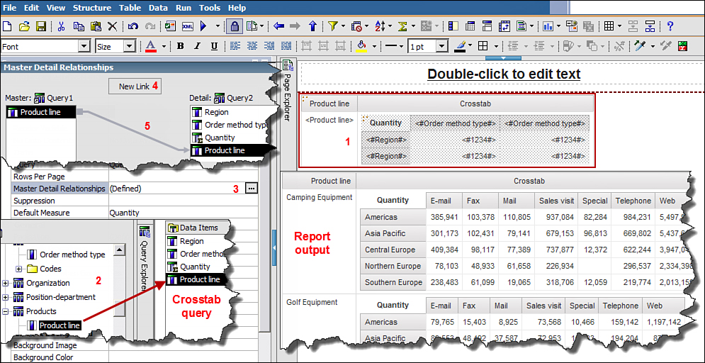
Figure 10.5. Create Master Detail Relationships in Report Studio.
79. Save the report.
Bidirectional Support
Bidirectional support enables you to display the report in Middle Eastern languages such as Arabic, Farsi, Hebrew, and Urdu. It enables you to set the user interface display to read from left-to-right or right-to-left. This is also referred to as flipping of the object or mirroring. It applies to objects like List, Crosstab, Graphs, URLs, and Text. The BiDi options must be set by the report developer. The BiDi changes are displayed in Cognos Connection, Cognos Viewer, and Cognos Workspace. BiDi output can be viewed in HTML, PDF, Excel, and Active Reports.
1. In Cognos Connection, click My Preferences > General tab > select the check box for Enable bidirectional support > in the Base text direction for content section (by default is left-to-right) change it to Right-to-left from the drop-down list > click OK.
2. Click Launch > Report Studio.
3. Select GO Data warehouse (query) package.
4. In the New window, select Crosstab > click OK.
5. Expand Sales and Marketing (query) > Sales (query) > Products > drag and drop Product line as Rows.
6. From Order method > drag and drop Order method type as Columns.
7. From Sales fact > drag and drop Quantity as Measures.
8. Run the report; notice the report currently reads from left-to-right.
9. Next you flip the Crosstab so it reads from right-to-left. To do this, click the Crosstab > in theProperties pane > Font & Text section > Direction & Justification option. Click the ellipses > in the Direction & Justification window > for Direction > select Right to left from the drop-down list > click OK.
NOTE: The Product line in the Crosstab has moved to the right.
Left-to-right: When the text is read from left to right, for example, English.
Right-to-left: When the text is read from right to left, for example, Arabic, Urdu, or Farsi.
Contextual: When the text has a combination of both (left-to-right and right-to-left) words in the sentence. In such case the flow from left-to-right or right-to-left is determined by evaluating the complete sentence. For example, if the first word is English, the flow will be left-to-right; however if the first word is Urdu, then the flow will be right-to-left.
10. Run the report, close Cognos Viewer.
11. Click Run menu > Run Options... > for Language > select Urdu (or Farsi, Hebrew, or Arabic) > select the check box for Enable bidirectional support > click OK.
12. Run the report.
NOTE: Some content like column headers will appear in the selected language, for example, Urdu, if the translated content is available. Otherwise, it will continue to appear in the default language. The intersection cells now appear in the language selected via Run Options.
13. Click Quantity > in the Properties pane > Data section > Data Format > click the ellipses > in the Data Format window, for Format type select Number > in the Properties section and scroll down to the bottom of the list > for Digit Shaping property > select National from the drop-down list > click OK.
14. Run the report.
NOTE: The numbers are now formatted in the national representation.
15. Click the Insert chart icon on the Standard Toolbar and select Column Chart > The Chart continues to appear in the default layout (of left to right).
16. To set the Bidi support for the chart, click the chart and repeat step 9.
17. Run the report; notice the legends have now moved to the left and the y-axis is on the right.
18. Click on the Chart, click the Axis Labels (on the left). In the Properties pane > Data section >Data Format > click the ellipses > for Format type select Number > in the Data Format window,Properties section > for Digit Shaping property> select National > click OK.
19. Run the report, and notice the numbers now appears in Urdu instead of English.
20. Save the report.
The example illustrates that the Bidi support options must be defined for each object in the report like the List, Crosstab, Prompts, Charts, and so on.
BUILDING CROSSTAB REPORTS
As you have seen earlier, Crosstab reports enable you to display data in a matrix form. You can use a Crosstab report to display unrelated (discontinuous) data in the same report. It is relevant to mention at this point that more data does not always communicate clearly, so you must understand your audience and then decide how much data you should nest in the report. Examples in this section highlight the capabilities that enable you to build a complex Crosstab report. When nesting rows and columns, you must drop in the appropriate drop zones. If you are unfamiliar with drop zones, refer toChapter 9.
Steps to Create a Crosstab Report with Unrelated (Discontinuous) Data
Figure 10.6 displays the report outputs.
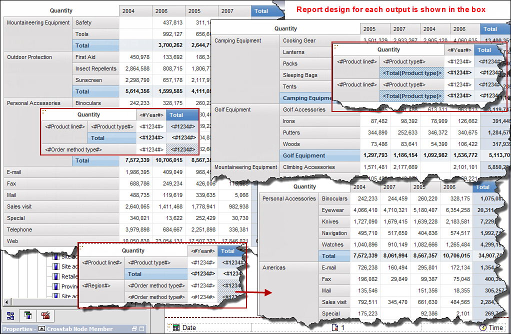
Figure 10.6. Design and output of complex Crosstab reports in Report Studio.
To create the crosstab report with unrelated data, perform the following steps:
1. In Cognos Connection, click Launch > Report Studio.
2. In the Select Package window > choose GO Data Warehouse (query).
3. In the New window > select Crosstab > click OK.
4. In the Source tab > expand Sales and Marketing (query) > Sales (query) > Sales fact > drag and drop Quantity as Measures.
5. Expand Time > drag and drop Year as Columns.
6. Expand Products > drag and drop Product line as Rows.
7. Expand Products > drag and drop Product type to the right of Product line (to nest it).
8. Run the report > close Cognos Viewer
9. Click the cell intersection (measure) > click the Summarize icon on the Standard Toolbar > select Total.
NOTE: The Summaries now appear for both rows and columns, as well as the overall totals for the entire report.
10. Run the report.
11. Close Cognos Viewer and return to Report Studio.
NOTE: You can add additional summaries as required or delete those you do not require. Now delete Total for Product line.
12. Click the Total for Product line (last row) > Delete.
13. Run the report.
14. Close Cognos Viewer and return to Report Studio.
15. Click the Total for Product type > in the Properties pane > Text Source section > Source Type > select Data Item Value from the drop-down list > for the next option in the Text Source section, click Data Item Value (option below Source Type) > select Product line from the drop-down list.
16. Run the report.
NOTE: The text Total for Product type totals now displays the name of the Product line.
17. Close Cognos Viewer and return to Report Studio.
18. Expand Order method > drag and drop Order method type below Product line as peer of Product line, as shown in Figure 10.6.
NOTE: You have just added data to the Crosstab that is not related to Product line and Product type and created a discontinuous Crosstab report. Doing this allows you to display unrelated data in the same report.
19. Run the report.
NOTE: You must page down to the end of the report or click the Bottom link to view the Order method type you added to the report.
20. Close Cognos Viewer and return to Report Studio.
21. Expand Retailers > drag and drop Region to the left of Order method type.
22. Run the report. Page down until you see both Product line and Order method.
23. Save the report.
CREATING CALCULATIONS
Enhance your report using calculations. Calculations here refer to arithmetic calculations as well as expressions that you create using string and date variables respectively. For example, you can create a calculation using data items using arithmetic operators, and create a full name to display on the report by concatenating the first name, middle name, and last name and extract year, month, or week days from a date value to display in the report.
Depending upon what you want to achieve, you can create a calculation using one of the following methods:
• Query Calculation enables you to create calculated columns in the report using items from the model in the Source tab, data items in the Data Items tab, query items used as prompts, or parameters in the report from the Parameters tab. You can use the Operators, Summary functions, Constants andConstructs like if...then...else to build the calculation in the Expression Editor.
You can include a Query Calculation in report body, that is List body, Crosstab, Chart as well as in the header and footer of the report.
• Layout Calculation enables you to display run-time information in the report, for example, current date, time, user locale information, and so on. Layout calculations are also commonly used to display prompt values in the report. Unlike a query calculation associated with a SQL that makes a trip to the database, the layout calculation uses preexisting items in a query and is rendered by the Cognos engine without sending it to the database.
To add a calculation to the report, Query Calculation or Layout Calculation, navigate to the Toolboxtab > drag and drop Query Calculation or Layout Calculation, as required, on to the work area.
Although you can drag and drop a Query Calculation and Layout Calculation to display items on the report, there may be occasions when you need to create calculations not to display on the report but rather to filter the data or for an interim processing of values. In such cases you can create a Query Calculation or a new data item in the query using the Query Explorer. To add a Query Calculation to the query, navigate to the Query Explorer > click the query you want to create a calculation in, for example, Query1 > navigate to the Toolbox tab > drag and drop a Query Calculation (or a Data Item) to the Data Items pane > in the Data Items Expression window create the required calculation in a similar manner, as shown in Figure 10.7, which illustrates steps for the example that follows next.
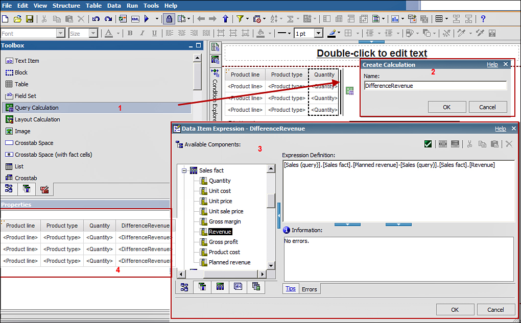
Figure 10.7. Create Query Calculation in Report Studio.
Steps to Create Query Calculation
These steps guide you on how to create a query calculation that is displayed on the report.
1. In Cognos Connection, click Launch > Report Studio.
2. In Package Selection window, choose GO Data Warehouse (query).
3. From the New window, select List > click OK.
4. Expand Sales and Marketing (query) > Sales (query).
5. Expand Products > drag and drop Product line, Product type onto the List in the work area.
6. Expand Sales fact > drag and drop Quantity onto the List in the work area.
7. Navigate to the Toolbox tab > drag and drop a Query Calculation at the end of the List, as shown in Figure 10.7.
8. In the Create Calculation window, type DifferenceRevenue > click OK.
9. In the Data Item Expression window, expand Sales and Marketing (query) > Sales (query) > Sales fact > double-click Planned Revenue.
10. Navigate to the Functions tab, expand Operators > double-click minus sign.
11. Navigate back to the Source tab, Sales fact > double-click Revenue > click Validate > clickOK.
12. Run the report.
13. Close Cognos Viewer and return to Report Studio.
14. Navigate to the Toolbox tab, and drag and drop a Block to the left of the List.
NOTE: Doing this will put the block above the List.
15. From the Toolbox tab, drag and drop a Table into the Block > in the Insert Table window, type 2 Columns and 1 Row > click OK.
16. From the Toolbox tab, drag and drop a Text item in the left cell of the Table > in the Text window, type Maximum Revenue: > click OK.
Singleton
17. From the Toolbox tab, drag and drop a Singleton to the right of the text in the left cell, shown as 4 in Figure 10.8.
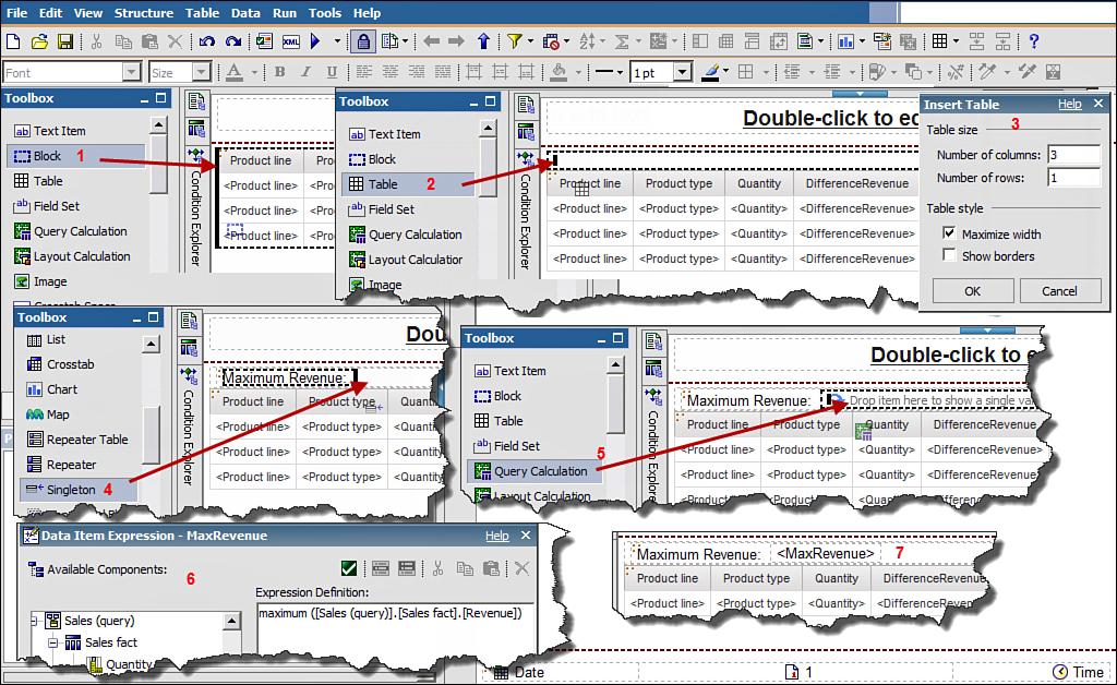
Figure 10.8. Use Query Calculation and Singleton to display summaries in the report.
18. From the Toolbox tab, drag and drop a Query Calculation on top of the Singleton, as shown inFigure 10.8.
19. In the Create Calculation window, type MaxRevenue > click OK.
20. In the Data Item Expression window, navigate to the Functions tab and expand Summaries; then double-click Maximum.
21. Navigate to the Source tab > expand Sales fact > double-click Revenue > type ) at the end of the expression > click Validate > click OK.
22. Run the report.
23. Replace maximum Revenue in step 19 with Maximum (Quantity); repeat 19–22.
NOTE: To test the maximum quantity calculation output, sort the Quantity column as descending and compare results.
Layout Calculation
24. Navigate to the Toolbox tab > drag and drop a Text item to the right cell of the Table.
25. In the Text window, type Report Create Date: > click OK.
26. From the Toolbox tab, drag and drop a Layout Calculation to the right of the text in right Table cell.
27. In the Data Item Expression window, navigate to the Functions tab > expand Report Functions > double-click ReportCreateDate() > click OK.
NOTE: In the Data Items Expression window, you can build the expression using options available in the Source tab, Data Items tab, Queries tab, Functions tab, Parameters tab, or the Macros tab. The Macros tab is only available if you use Cognos BI v10.2 or above. The Layout calculation enables you to enhance the report layout.
28. Click the right Table cell > click the Right align in the Style Toolbar.
29. Click the Block (Note: use the Select Ancestor icon in the Properties pane if required) > in theProperties pane > click on Box > click Padding ellipses > type 20 px at top and 20 px at thebottom > click OK.
NOTE: Use the Padding option to add spaces around an item to enhance the report output.
30. Run the report.
31. Save the report.
NOTE: You can format the Date using the Properties pane.
FILTERS AND SUMMARIES
This section discusses how to create filters and work with summaries. Both filter and summaries can be created via the Data menu option, Filter/Summarize option on the toolbar, or manually. When working with summaries, you can specify the rollup and aggregations using the Properties pane of the data item. Use the properties Aggregation Function and Rollup Aggregation Function options to specify how the data item should be aggregated or rolled up to meet your reporting needs, for example, Count, Total, Count Distinct, None, Automatic, and so on. You can control the automatic generation of the summary row via the Automatic group and summary behavior for lists check box. This option is available via the Tools menu > Options > Report tab. This change does not impact existing objects but only future actions.
You can create filters in the report to display subsets of data that meet your reporting needs. You can filter the data in the report using prebuilt filters that are published with the Package. You can just drag and drop the filters onto the report from the Insertable Objects pane. By default when you apply filters on a report the filters are applicable on all rows.
You can filter the data in the report by creating filters in queries, expressions, and by using prompts. Prompts are discussed in the next section. You can apply filters on detail rows as they exist in the database, auto-summarized rows as they appear in the report, or summary rows added to the report.
By default, the values in the report are summarized for each row. To verify how the data is being summarized in the report, click the Query Explorer > Query1 > in the Properties pane > Datasection > Auto Group & Summarize, notice this option is set to Yes. If you want to examine the individual rows and ensure which rows from the data source are included in the summary, you can change the Auto Group & Summarize to No. This displays each individual item that contributes to the summary, as shown in Figure 10.9.

Figure 10.9. Auto Group & Summarize option to display summarized rows or individual items.
When you filter the rows, you can specify if the filter is to be applied on detail rows or summary rows. The filter that you need to apply is guided by your reporting requirement. You can create filters in the report using Data menu > Filters, or simply click the Filters icon on the Standard Toolbar >Edit Filters.... You can then create filters using the Filter window. There are two tabs: Detail Filtersand Summary Filters. Use the Detail Filters tab to create filters at the detail level, for example, individual rows of data and the Summary Filters tab to create summary level filters, for example, on group totals or overall totals.
Detail Filters
Create detail filters to work with individual rows of data. You can also choose to apply the filter on each row either before it is aggregated or after. Each of these options is discussed in Table 10.1.
Table 10.1. Filter Options and Description
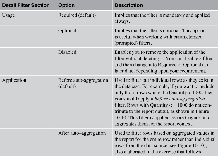
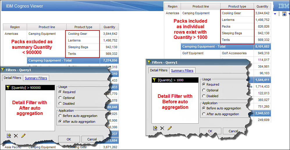
Figure 10.10. Result of Before auto-aggregation and After auto-aggregation Detail filters.
To create a Detail filter, perform the steps outlined in Figure 10.11 and described in the list that follows.
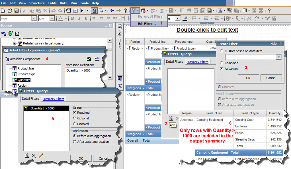
Figure 10.11. Create a Detail Filter in the report.
1. In Cognos Connection, click Launch > Report Studio.
2. In the Select Package window, select GO Data Warehouse (query).
3. In the New window, select the List report output type > click OK.
4. In the Insertable Objects pane, expand Sales and Marketing (query) > expand Sales (query) > expand Retailers > drag and drop Region onto the List.
5. Expand Products > drag and drop Product line, Product type, and Product to the List.
6. Expand Sales fact > drag and drop Quantity to the List.
7. Ctrl+Click Region, Product line, and Product type > click Group/Ungroup on the Standard Toolbar.
8. Click Quantity > Summarize on the Standard Toolbar > Total.
9. Run the report.
NOTE: Examine the summary line.
10. Click Undo.
11. Click Product column in the list > click Delete.
12. Click Data menu > Filters > Edit Filters...
13. In the Filters window, click the Add icon.
14. In the Create Filter window, click Advanced > OK.
15. In the Detail Filter Expression window, navigate to the Data Items tab > double-click Quantity. At the end of the expression, type > 1000 (as shown in Figure 10.11) > click Validate > click OK.
NOTE: Ensure in the Filters window, Application section that by default the filter will be appliedBefore auto aggregation.
16. Run the report, and examine the values in the Quantity column.
17. In the Filters window, change the Usage to Disabled > click OK.
18. Run the report.
19. Click the Filters icon on the Standard Toolbar > Edit Filters... > click the Quantity > 1000filter > change Usage to Required > click OK.
20. Run the report.
NOTE: Rows with Quantity > 1000 are the only ones included in the total; hence the total quantity is much lower than the output without the filters. The important point to note here is you filtered out Quantity > 1000 before aggregation.
21. Click the Filters icon on the Standard Toolbar > Edit Filters... > click Quantity > 1000 > change Application to After auto aggregation > click OK.
22. Run the report.
NOTE: No row was removed as in every row after aggregation, Quantity > 1000. So you will increase the value in the filter to 900000.
23. Click the Filters icon in the Standard Toolbar > Edit Filters... > in the Filters window click the filter Quantity > 1000 to select it > in the Filters window, click the Edit (pencil) icon to edit the selected filter > change 1000 to 900000 (that is, Quantity > 900000) > click OK > click OK again.
24. Run the report.
NOTE: Packs was removed from the report output as it had Quantity < 900000.
25. Save the report as Product_Filters.
Summary Filters
Use the Summary Filters tab to create Summary Filters. Summary filters apply on rows that are grouped in the report.
To create a Summary filter, perform the steps outlined in Figure 10.12 and described in the list that follows.
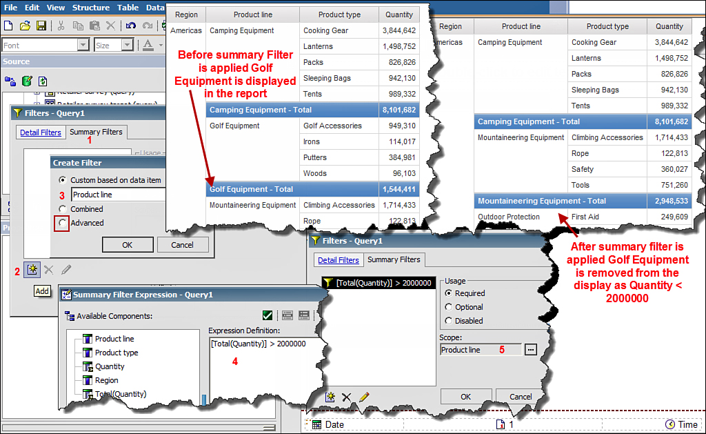
Figure 10.12. Create a Summary Filter in a report.
1. Open the report Product_Filters created in the previous step 25.
2. Click the Filters icon in the Standard Toolbar > Edit Filters... > click Quantity > 900000 >select Disabled in the Usage section.
3. Navigate to the Summary Filters tab > click the Add icon.
4. In the Create Filter window, click Advanced radio button and click OK.
5. In the Summary Filter Expression window, in Available Components pane, double-click [Total(Quantity)] > in the Expression Definition section > at the end of the expression (after Total Quantity) type > 2000000 > click Validate > click OK, as shown in Figure 10.12.
6. In the Filters window, click Scope ellipses > select the Product line check box > click OK > clickOK again.
7. Run the report.
NOTE: After applying the summary filter, Golf Equipment for Americas is removed from the output as the total quantity is < 2000000.
8. Save the report.
CONDITIONAL HIGHLIGHTING
You can highlight exceptional data in the report using Conditional Style. For example, quantities under < 900000 can be highlighted red, whereas those above 2000000 can be highlighted green to indicate bad and good sales, respectively. You can also use it to conditionally display items in the report or use the same report to display information in different languages depending upon the users’ locale.
To define conditions that determine exceptional data, you must create variables. You can work with one of the three types of variables:
• Report Language Variable should be used when the values for the data item are different languages. When working with Report Language Variable, you need to specify the languages to work with; unlike String and Boolean Variables, you are not required to create a condition.
• String Variable should be used when the data item can have multiple values, for example, Monday, Tuesday, and so on. You must create a condition that assigns values to the different options the variable can evaluate to, for example,
IF ( Quantity > Target) THEN ('Green')
ELSE IF (Status= 'N' and Store_Flg ='Y' or Quantity =Target )
THEN ('Yellow')
ELSE ('Red')
• Boolean Variable should be used if the expression result will be evaluated as Yes or No. For example, Quantity > 900000 will either evaluate to True or False.
To create a Conditional style to highlight exceptional data in the report, perform the steps outlined inFigure 10.13 and described in the list that follows.

Figure 10.13. Highlight data in the report using Conditional Style.
1. In Cognos Connection, click Launch > Report Studio.
2. In the Select Package window, select GO Data Warehouse (query).
3. In the New window, select List report template > click OK.
4. Expand Sales and Marketing (query) > Sales (query) > Products > drag and drop Product line and Product type to the List.
5. Expand Order method > drag and drop Order method type to the end of the List.
6. Expand Sales Fact and drag and drop Quantity to the end of the List.
7. Ctrl+click Product line, Product type and > click Group/Ungroup.
8. On the Explorer Bar, navigate to Conditional Explorer > click the Variables folder > drag and drop a String Variable to the Variables pane.
9. In the Report Expression window, navigate to the Functions tab > Operators folder > build the following expressions using items from the Data Item tab:
if ([Query1].[Quantity] < 900000) then (‘Red’) else if ([Query1].[Quantity] > 2000000) then (‘Green’)
NOTE: Those rows that do not fall into the category of Red or Green will appear as default and are not handled by the expression by an explicit ELSE. Depending upon your requirement you may need to frame your expressions accordingly.
10. Validate the expression > click OK.
11. In the Properties pane > Miscellaneous > Name, type Sales_exception.
12. In the Values pane > click Add icon > in the Add window > type Red > click OK.
13. Repeat step 12 for Green.
NOTE: The variable names must exactly match as defined in the expression. The values are case-sensitive and will not yield wanted results if the two do not match.
14. Click Page Explorer > Page1 > click Quantity.
15. In the Properties pane for Quantity > Conditional > click Style Variable ellipses.
16. In the Style Variable window, select Sales_exception from the drop-down list > click OK.
17. Click Condition Explorer bar > select Red > in the Properties pane > Color & Background section > click Background Color ellipses > click Web Safe Colors tab > choose anyred color > click OK > double-click the Condition Explorer bar.
NOTE: Double-clicking the Condition Explorer bar brings you out of the conditional mode.
18. Click Quantity column > click the Condition Explorer bar > select Green > in theProperties pane > Color & Background section > click the Background Color ellipses > navigate to Web Safe Colors tab > click any green color > click OK.
19. Double-click the Condition Explorer bar to switch off the conditional formatting mode.
20. Run the report.
NOTE: All rows with Quantity < 900000 are displayed in red, whereas all rows with Quantity > 2000000 are displayed in green. You can use this conditional highlighting at other levels of the report also.
21. Save the report.
PROMPTS AND PARAMETERS
Prompts enable users to provide input when running the report to focus the data in the report. The input value provided by the user is used to filter the data in the report.
There are several prompt types available in the Toolbox tab that you can drag and drop onto your report to build prompts. The prompt type you include in the report is guided by your reporting requirement, data item values, data type, and the audience of the report to name a few. They help you choose the most appropriate prompt for your reporting requirement. Some filters enable you to work with a single selection at a time, whereas others enable selecting multiple values at a time. In addition, you can use most of these filters to define range filters or cascading prompts, discussed later in this section.
The available prompt types and tools in the Toolbox tab are as follows:
• Text Box Prompt: Enables users to type in a value to be used to filter the data in the report. This prompt type is appropriate when the users know the exact value that they are looking for.
• Value Prompt: Enables users to select a value displayed in the list. The report is then filtered based on the value selected from the list.
• Search & Select Prompt: Enables users to search the value they want to use to filter the report. This is appropriate if the options available are large and may take a long time for the user to go through the list. Search enables them to quickly search for a value and choose from the search result. The data in the report is filtered on the value selected from the search result.
• Date & Time Prompt: Enables users to filter the data in the report based on date and time. This is appropriate when the column used for filtering is a datetime or timestamp column. You can also use this to build a date and time range.
• Date Prompt: Enables users to filter the data in the report based on a date value. This is appropriate if the column is a date data type. You can use it to build a date range filter.
• Time Prompt: Enables users to filter the data in the report based on time. You can use this to create a filter on a time or a time range.
• Interval Prompt: Enables users to filter data in the report based on a time interval, for example, 2 days after the due date.
• Tree Prompt: Enables users to select one or more values from the list that is presented in a hierarchical manner.
• Generated Prompt: Enables Report Studio to generate a prompt based on the data type of the data item.
• Prompt Button: Enables the report author to provide a button next to the prompt for users to navigate, for example, Cancel, Back, Next, Finish, or Reprompt.
• Prompt API: Enables JavaScript applications to interact with IBM Cognos BI report prompts for validation or custom interaction purposes. Report authors can use the JavaScript Prompt API as a way to customize prompt interactions in reports. You can use Prompt API to set default values using expressions or query data, set user selections, validate typed-in values using patterns, and so on. This option is introduced in Cognos BI 10.2. Prompt API is supported in Report Studio, Cognos Viewer, Cognos Workspace, and Cognos Workspace Advanced (other than prompt pages). You can find Prompt API samples in the Samples_Prompt_API folder of your install directory.
You can create prompts in a report using any one of the following ways:
• Create parameters in the report for the data item you want the user to provide input for in the report: When you use a parameter in the report for a data item, the user is prompted to provide a value when the report runs. The data in the report is filtered based on the value provided by the user. Parameters are commonly used in a data item or filter expression.
• Add a prompt item to the report: You can add a prompt item to the report by dragging and dropping a prompt type from the Toolbox tab to the report page.
• Add a prompt page to the report: Adding a prompt page to the report displays the prompts on a separate page. You can add a prompt page to the report by navigating to Page Explorer > Prompt Pages and then dragging and dropping a Page from the Toolbox tab to the Prompt Pages pane. Double-click the Prompt Page to open it. By default there are four buttons displayed at the bottom of the page: Cancel, Back, Next, and Finish. To modify the button properties, you can click the button and modify its properties using the Properties pane. To change the displayed text on the button, you can drag and drop a Text Item from the Toolbox on top of the button, and type the required text. For example, drag and drop a Text Item from the Toolbox tab on top of the Finish button; in the Text box, type GO and click OK. Finish is now replaced by GO. You can change the font type color using theProperties > Font & Text section > Font option.
Prompts enables you to get user input and use it to filter data in the report. You can use the Build Prompt Page button on the toolbar to quickly build prompts. Doing this enables you to get user input in the prompt page and then display the report layout on separate report pages.
Creating Prompts Using Parameters
To create prompts using parameters, perform the steps shown in Figure 10.14 and described in the list that follows.
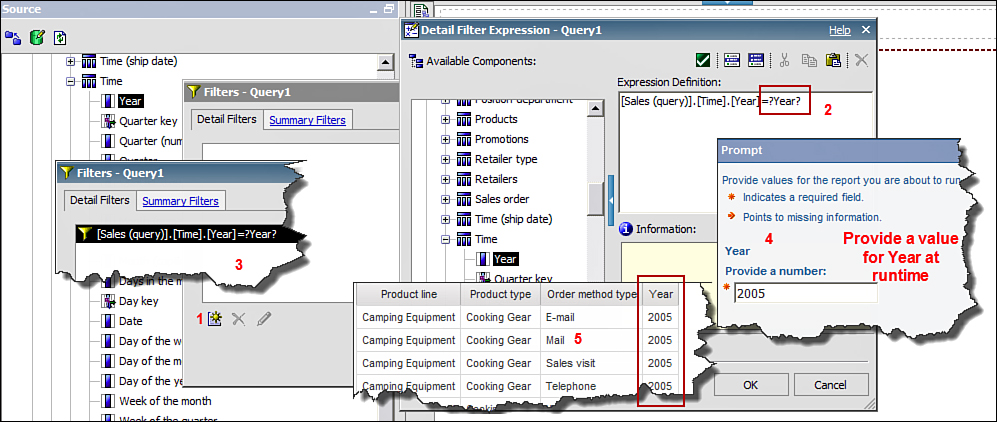
Figure 10.14. Create prompts using parameters.
1. In Cognos Connection, click Launch > Report Studio.
2. In the Select Package window, choose GO Data Warehouse (query).
3. In the New window, choose List report output type > click OK.
4. In the Insertable Objects pane > Sales and Marketing (query) > Sales (query) >Products > drag and drop Product line and Product type to the List in the work area.
5. From Order method > drag and drop Order method type to the List.
6. From Time dimension > drag and drop Year to the List.
7. Click the Data menu > Filters > Edit Filters ...
8. In the Filters window, in the Detail tab > click Add.
9. In the Create Filter window, click Advanced > click OK.
10. In the Detail Filter Expression window, in the Available Components pane, expand Timedimension > drag and drop Year to the Expression Definition section > at the end of the expression type =?Year? (shown as 2 in Figure 10.14) > click OK > click OK again.
11. Run the report.
12. In the Prompt window, for the Year type 2005 (or 2012 if using Cognos 10.2 samples) inProvide a number box > click OK.
NOTE: The report displays rows for the year provided by the user for the prompt values only (refer toFigure 10.14).
13. Save the report as Product_prompts.
Creating Value Prompts
To create value prompts, perform the steps shown in Figure 10.15 and described in the list that follows. You can also create a Value Prompt using the Build Prompt Page option available on the toolbar.
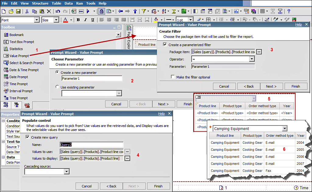
Figure 10.15. Create a Value Prompt.
1. In Report Studio, select File menu > Open > Product_prompts report created in the previous section.
2. Click Data menu > Filters > Edit Filters...
3. In the Filters window, click the Year filter > change Usage to Disabled > click OK.
4. Navigate to the Toolbox tab, and drag and drop a Value prompt to the left of the List.
NOTE: This displays the prompt above the list.
5. In the Prompt wizard > choose Parameter window > provide a meaningful name for the parameter > click Next.
6. In the Create Filter window, select Create a parameterized filter check box (if not already selected) (refer to Figure 10.15).
7. For Package item, click the ellipses > Sales and Marketing (query) > Sales (query) >Products > Codes > Product line code > click OK > click Next.
NOTE: You can select the Make the filter optional check box if the filter is not mandatory.
8. In the Populate control window, for Values to display, click the ellipses.
9. In the Choose Package Item window > expand Sales and Marketing (query) > Sales (query) >Products > select Product line > click OK > click Finish.
NOTE: Changing the display value to a Product line displays the Product line description, which is more meaningful than displaying the code. Although this is the general rule, the display value is determined by the report requirement.
10. Click the Value prompt > navigate to the Properties pane > General section > Auto-Submit> change the value to Yes.
11. Run the report.
12. In the Prompt window, for the Product line code type 991 > click OK.
13. Save the report.
Creating a Cascading Prompt
Cascading prompts enable you to use the value from one prompt to filter values available in another prompt. This is useful because it enables you to display only those values in the second prompt that are related to the choice made in the first prompt. For example, if you select Camping Equipment as the Product line in the first prompt, the second prompt Product type would display only those product types that belong to the Camping Equipment product line. This way the user is not left to remember the valid choices to make from the prompt.
To create cascading prompts, perform the steps outlined in Figure 10.16 and described in the list that follows.
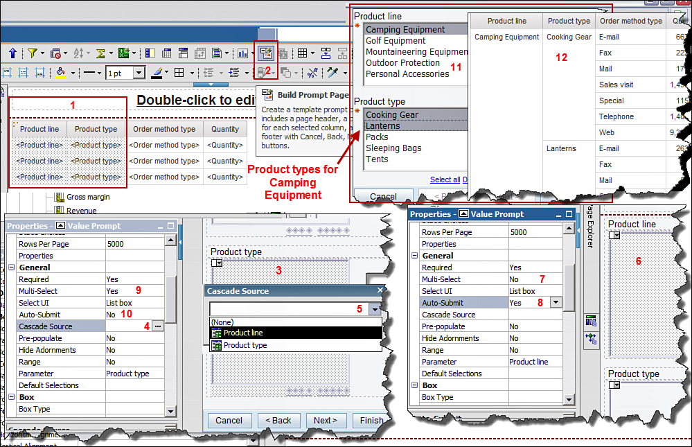
Figure 10.16. Create a cascading prompt in Report Studio.
1. In Cognos Connection, click Launch > Report Studio.
2. In Select Package window, select GO Data Warehouse (query) package.
3. In the New window, select List report output type > click OK.
4. In the Source tab, expand Sales and Marketing (query) > Sales (query) > Products > drag and drop Product line, Product type to the List.
5. Expand Order method > drag and drop Order method type to the List.
6. Expand Sales fact > drag and drop Quantity to the List.
7. Click Product line and Product type > click Group/Ungroup on the Standard Toolbar.
8. If not already selected, Ctrl+Click Product line, Product type > click the Build Prompt Pageicon on the Standard Toolbar.
NOTE: Two prompts, Product line and Product type, are added on a new prompt page. If you navigate to the Page Explorer, in Prompt Pages folder Prompt, Page1 is added. Also if you navigate to theQuery Explorer, new queries for Product line and Product type is added to the report with two filters.
9. Click the Product type prompt > navigate to Properties pane > General > click Cascade-Source ellipses > select Product line > click OK.
10. Click the Product line prompt > navigate to the Properties pane > General > Multi-Select> change it to No.
11. In the Properties pane for Product line prompt > General > Auto-Submit > change toYes.
12. Click Product type prompt > in the Properties pane > General > Multi-Select > set to Yes, if not already selected.
13. In the Properties pane for Product type prompt > General > Auto-Submit > set to No, if not already selected.
14. Run the report > select Camping Equipment for Product line > Cooking Gear and Lanterns> click Finish.
NOTE: When you select the Product line the Product type options available change depending upon the Product line. The report output displays data for Camping Equipment product line and product types Cooking Gear and Lanterns only.
15. Navigate to the Page Explorer, click Page1 > click Product line > click theSection/Unsection icon on the Standard Toolbar.
16. Run the report.
NOTE: The same information is now displayed in another format.
17. Undo the change.
18. Save the report.
QUERIES
Report Studio enables you to create queries manually using calculations, SQL, MDX and so on to enhance the report. It enables you to work with data not available in the Framework Manager package to build the report.
There may be times where all the data you need from the underlying data source may not be exactly in the form you need. It is not uncommon that report authors need to display the report data rolled up at different granularity. For example, you need to show the daily and Month-to-Date (MTD) values in the same row. Although you may have the daily values available, you need to generate MTD values within the report. Although there are several ways to accomplish this, the example here is used to illustrate examples of working with queries in Report Studio using tools available, for example, Join, Union,Intersect, Except, SQL, and MDX.
• Query: Creates a query manually by dragging and dropping a Query from the Toolbox to the Query pane and adds data items to the query. After you have created the query, you may associate a report object with it to display it in the report.
• Join: Enables you to join two or more queries into one. You can then associate the report object with the joined query to display the data items from the query in the report.
• Union: Enables you to add the data from two or more queries into one. You can choose to remove or keep the duplicate rows from the two queries to handle duplicate rows.
• Intersect: Enables you to create a query with only those rows that are common to the two or more queries used in the intersect.
• Except: Enables you to create a query with rows that belong to one query result but not the other.
• SQL and MDX: Enable you to create a query using SQL that retrieves the required data from the database directly. This option is used when the required table is not already available in the package however it exists in a data source. When you use SQL and MDX, the package is bypassed entirely including security, data formatting, and so on. For this reason, only privileged users can write/run reports using SQL or MDX.
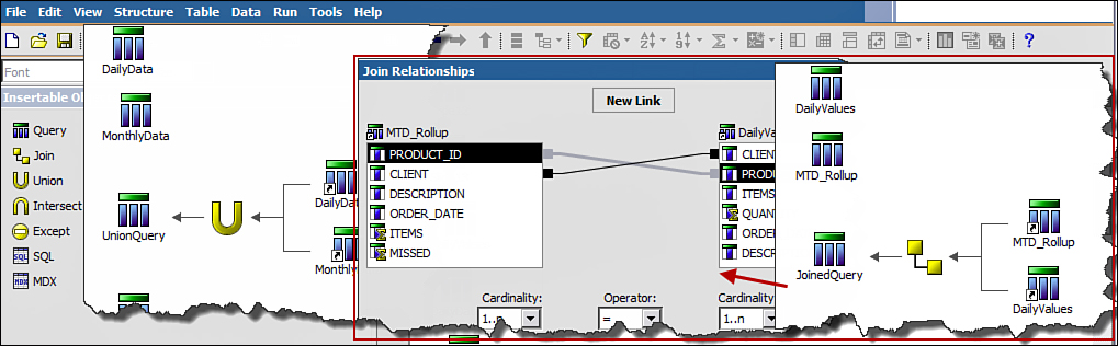
Figure 10.17. Create manual queries in Report Studio.
This exercise demonstrates how you can join data from two or more queries into a single query and display it in the report. This is especially helpful if the aggregation levels of data items are different. In the following exercise you display daily and monthly values in the same report by bringing data from two different queries together, for example, a nonaggregated query and an aggregated query. To create queries manually for reporting, perform the following steps:
1. In Cognos Connection, click Launch > Report Studio.
2. In the Select Package window, select GO Data Warehouse (query).
3. In the New window, select List report output type > click OK.
NOTE: The List is currently empty. You build the query first in the upcoming steps and then associate the List with the joined query to display the final result in the report.
4. Navigate to the Query Explorer > click Queries > double-click on Query1.
5. In the Source tab, expand Sales and Marketing (query) > Sales (query) > Products > drag and drop Product line, Product type, Product to the Data Items pane on right.
NOTE: Query1 holds daily values.
6. Expand Sales fact > double-click Revenue to add it to the Data Items pane.
7. Expand Time > double-click Date.
8. In the Properties pane for Query1, navigate to Miscellaneous section > Name > type Daily.
9. Click the Run menu > View Tabular Data, and examine the data currently returned by the query. (It’s all Product lines and all years.)
10. Drag and drop Product line from the Data Items pane to the Detail Filters section.
11. In the Detail Filter Expression window, navigate to the Functions tab > expand Operatorsfolder > double-click the <>symbol > at the end of the expression, type ‘Personal Accessories’ >Validate > click OK.
NOTE: You can also select the Product line in the Data Items tab (Filter window) > click the Select Values icon (next to Validate) > select Personal Accessories from the list > click Insert > ensure Personal Accessories is enclosed in quotes to match step 11.
12. In the Data Items pane, drag and drop Date from the Data Items pane to the Detail Filterssection.
13. At the end of the expression type =‘07-21-2005’.
NOTE: Your expression should look like [Date]='07-21-2005' . If you have Cognos samples 10.2 or later, use 2012 as the year.
14. Click Run > View Tabular Data > click OK.
15. Review the data displayed in Cognos Viewer to ensure it is correct.
16. Click the Up arrow to go a level up in the Query pane.
17. Drag and drop a Query from the Toolbox to the Query pane.
NOTE: This second query will hold the monthly values.
18. Click Query1 > in the Properties pane > Miscellaneous section > Name > type Monthly.
19. Double-click the Monthly query.
20. From Products > drag and drop Product line, Product type, and Product to the Data Items pane.
21. From Time > drag and drop Year and Month (Numeric) to the Data Items pane.
22. From Sales fact > drag and drop Revenue to the Data Items pane.
23. In the Data Items pane, click Revenue > in the Properties pane > navigate to Data Itemsection > Name section> type Monthly Revenue > for Aggregate Function > ensure Total is selected.
24. From the Data Items pane drag and drop Product line to the Detail Filters section.
25. In the Detail Filter Expression window, type <> ‘Personal Accessories’ > Validate > click OK.
26. From the Data Items pane drag and drop Year to the Detail Filters section > at the end of the expression, type =2005 and > from the Data Items pane drag and drop Month (numeric) at the end of the expression > type =7 > Validate > click OK.
The expression should look like this:
[Year]='2005' and [Month (numeric)]=7
NOTE: If you use sample data from Cognos 10.2 or later, use 2012 for Year. You can also build an expression based on parameters and prompt values, for example, year ([Date])=year (?ReportRunDate?) and month ([Date])=month (?ReportRunDate?).
27. Click Run > View Tabular Data > validate the data in the query.
NOTE: Now you have a report for specific product lines for July for the year selected, for example, 2005.
28. Click the Up arrow to navigate to the Query pane > drag and drop a third Query from theToolbox to the Query pane, for example, Query1.
29. Drag and drop a Join from the Toolbox to the right of Query1.
30. Ensure Query1 is selected, in the Properties pane navigate to Miscellaneous > Name > typeJoinedDailyMonthly.
31. Drag and drop Daily query in one of the empty boxes and Monthly query in another empty box in the join.
32. Double-click the Join (yellow box icon) > click the New Link button and join the columns on each side that satisfies the join condition, for example, Daily.Product line with Monthly.Product line, and so on.
NOTE: You must click the New Link button for each link you want to create. You can have multiple links between the two queries when the join is on more than one column.
33. Repeat step 30 and create new link for Daily.Product type with Monthly.Product type and also for Daily.Product with Monthly.Product.
34. Review the Cardinality and ensure that it is correct. For this example, proceed with default Modify if required depending on the underlying data > click OK.
35. Add data items to the third query now, double click JoinedDailyMonthly > from Daily query, and drag and drop all the data items to the Data Items pane.
36. From Monthly query > drag and drop Monthly Revenue to the Data Items pane.
37. Click the Run menu > View Tabular Data > ensure data is correct.
38. Navigate to the Page Explorer > Page1 > click the List > click the Select Ancestor icon to select the List object. In the Properties pane > Data section > Query > click the ellipses and selectJoinedDailyMonthly.
NOTE: JoinedDailyMonthly is the new query you created that has data from two different queries.
39. Navigate to the Data Items tab > drag and drop all data items from JoinedDailyMonthlyquery onto the list.
40. Click the Date column in the List > click Section/Unsection on the toolbar.
41. Ctrl+Click Product line, Product type columns in the List > click Group/Ungroup on the toolbar.
42. Run the report.
43. Save the report.
CONDITIONAL BLOCKS
Use Conditional Blocks to display objects/items in a report based on a condition. For example, in the same report you can display sensitive or standard employee or sales information depending upon the user logged on. A common example is when you have multiple vendors that you distribute the same report to; however, before you send the report out, you want to display the logo in the report for that specific vendor. In such a scenario you can put the logo in a Conditional Block and display based on the vendor name or code depending on how your data is structured. For every option you want to specify, you can control by using Block Variable. A Block Variable can be a language variable, string variable, or a boolean variable.
To create Conditional Blocks, perform the steps outlined in Figure 10.18 and described in the list that follows.
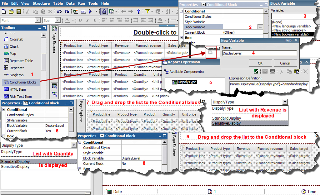
Figure 10.18. Use Conditional Blocks to conditionally display different information in the same report.
1. In Cognos Connection, click Launch > Report Studio.
2. In the Select Package window, select GO Data Warehouse (query).
3. In the New window, select List report output type > click OK.
4. Expand Sales and Marketing (query) > Sales (query) > Products > drag and drop Product line, Product type.
5. Expand Sales fact > drag and drop Revenue, Planned Revenue.
6. Expand Sales target (query) namespace > Sales target fact > drag and drop Sales target.
7. Navigate to the Toolbox tab > drag and drop a List item to the right of the existing List.
NOTE: This adds the List object below the existing List. The first list contains sensitive information for Sales target, Revenue, and Planned Revenue. In the second List you can add standard product information to be viewed by everybody else.
8. Navigate to the Source tab > Sales (namespace) > Products > drag and drop Product line,Product type, Product to the second List.
9. Expand Sales fact > drag and drop Quantity, Unit Price to the second List.
10. Navigate to the Toolbox tab > drag and drop a Conditional Block to the left of the first List, (refer to Figure 10.18).
NOTE: This adds the Conditional Block above the first list. Generally speaking, if you drop the items, for example, Conditional Block, to the left of the List, it appears above the List. If you drag and drop items to the right, the item appears below the List.
11. Navigate to the Page Explorer > click Prompt Pages > in the Toolbox tab > double-click Page(which adds Prompt Pages1 to the Prompt Pages pane).
12. Double-click Prompt Pages1 to open it > navigate to the Toolbox tab > drag and drop Value Prompt on to the Prompt Page.
13. In the Prompt wizard > for Create a new parameter, type DisplayType > click Finish.
14. Click the Value Prompt > in the Properties pane in the Data section > click Static Choicesellipses.
15. In the Static Choices window, click the Add icon > in the Edit window, type StandardDisplay for both Use and Display values > click OK.
16. In the Static Choices window, click the Add icon again > in the Edit window, typeSensitiveDisplay for both Use and Display values > click OK > click OK again.
NOTE: You created prompts that enable you to display the appropriate list with sensitive or standard data to illustrate the usage of Conditional Blocks.
17. Navigate to Page Explorer > Page1 > click the Conditional Block > in its Properties pane >Conditional section > click the Block Variable ellipses.
18. In the Block Variable window, select new boolean variable from the drop-down list > in theNew Variable window, type DisplayLevel > click OK.
19. Navigate to the Parameters tab > drag and drop DisplayType to the Expression Definitionpane. At the end of the expression, type =‘StandardDisplay’ > click on Validate > click OK > clickOK again.
20. Click the Conditional Block > in its Properties pane > Conditional section > Current Block > change the value to Yes using the drop-down list.
21. Click the List that has Quantity and Unit Price > drag and drop into the Conditional Block.
NOTE: You can select the List object by clicking the three orange dots (on top left) of the List or use the Select Ancestor icon in the Properties pane.
22. Click the Conditional Block again > in its Properties pane > Conditional section > clickCurrent Block > change its value to No.
NOTE: Notice the Conditional Block appears empty when you change its value to No. You will now drag and drop the next list in the Conditional Block.
23. Click the List > drag and drop it into the Conditional Block.
24. Run the report > in the Prompt Page > select DisplayType > StandardDisplay. The List with Unit Price and Quantity displays.
25. Run the report again > in the Prompt Page > select DisplayType > SensitiveDisplay. The List with Revenue, Planned Revenue, and Sales target displays.
DRILL-THROUGH REPORTS
Drill-Through reports enable you to navigate from one report to another report (target report) and view related data while retaining the context from the first report (source report). You can drill through to List, Crosstab, Chart, and Map reports using relational and dimensional data. Use drill-through to navigate from one report to another or to specific locations in the report. You can drill-through to and from a Report Studio report, Analysis Studio analyses, and Query Studio queries.
There are two options to set up a drill-through access: from a report and from a package, as described in the following sections.
Drill-Through from a Report
In Report Studio, you can specify a report as a source report (navigate from) and the report that you want to navigate to as target report (navigate to). After the report author has specified the source and target reports, users can drill through from the source report to the target report. You define the drill-through path from the source to the target report to allow users to keep the context of the source report in the target report.
The first step is to create the target report and then create the source report. Next, in the source report you specify the target report via the drill-through definition option. In the drill-through definition, you map the values that must be passed from the source report to the target report, which allows you to retain the context of the source report. You can pass parameters or data items from the report as required to the target report.
You can choose from the following three Drill-Through options when defining the drill-through path from the source to the target report.
• The Do not use parameter option should be used when you do not want to pass any value.
• The Pass data item value option should be used when you want to pass the value of the selected data item from the source report to the target report.
• The Pass parameter value option should be used when you want to pass the value of the selected parameter to the target report.
NOTE: You can display the parameters passed in the report to display the context, for example, ParamDisplayValue(‘ReportRunDate’) and so on.
You should identify the column or row that you want to allow users to drill through from. The cells that you set up drill through on appear as links in the source report and allow the users to drill through to the target report when they click the link.
A report can be set up as a source and a target report at the same time. For example, report A could be the source report for report B (target) and the target report B can be the source for report C and so on.
To create a drill-through report, perform the following steps:
1. In Cognos Connection, click Launch > Report Studio.
2. From the Select Package window, choose GO Data Warehouse (query) package.
3. From the New window, choose List report output type > click OK.
Define Target Report
You first create the target report and define a parameter that you can use to map to the source report. The steps to accomplish this are outlined in the following section.
4. In the Source tab, navigate to Sales and Marketing (query) > Sales (query).
5. From the Source tab, expand Products > drag and drop Product line, Product type to the List.
6. Expand Order method > drag and drop Order method type to the List.
7. Expand Sales fact > drag and drop Quantity to the List.
8. Expand Time dimension > drag and drop Year to the List.
9. Click the Filter icon on the Standard Toolbar > choose Edit Filters.
10. In the Filters window, from the Details Filters tab > click Add (bicycle gear icon at the bottom) > select Advanced > click OK.
11. In the Detail Filter Expression window, navigate to the Data Items tab > drag and drop Yearfrom the Available Components pane to the Expression Definition section.
12. At the end of the Expression, type =?pYear? > click the Validate icon (green tick), as shown inFigure 10.19.
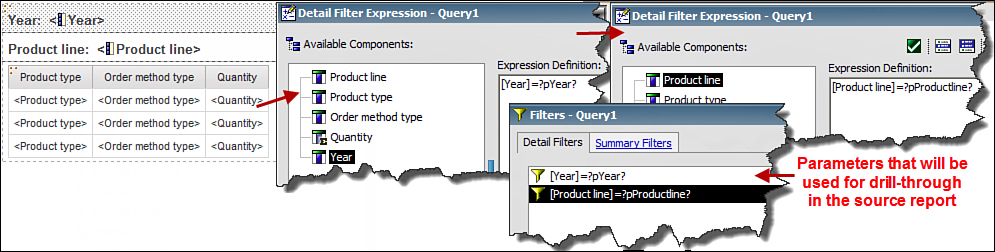
Figure 10.19. Create parameters in the Target report.
NOTE: The expression should look like Year=?pYear?
13. In the Prompt window, type 2005 (or 2012 for Cognos 10.2 samples) > click OK > click OK again.
14. In the Filters window, from the Detail Filters tab > click Add again.
15. In the Create Filter window, select Advanced > click OK.
16. In the Detail Filter Expression window, navigate to the Data Items tab > drag and drop Product line from Available Components pane to Expression Definition section.
17. In Expression Definition, at the end of the expression type =?pProductline? > click Validate. In the Prompt window choose Camping Equipment > click OK > click OK again.
18. Save the Report as ProductLinebyOrderMethodTarget.
NOTE: To display the value of the parameter passed in the target report from the source report, drag aLayout Calculation from the Toolbox tab and in the Report Expression window, navigate to theParameters tab and drag and drop the required parameter to the Expression Definition section. Then click Validate and click OK.
Create the Source Report
You will now create the source report, which is the first report that runs and enables you to navigate to the target report you created in the previous step. As you go through the steps, notice that you call the target report and use the parameters you created in the target report to map to the source report data item to keep context.
19. In Report Studio, click File menu > New to create the Source report.
20. In the New window, select Crosstab report output type > click OK.
21. Expand Products > drag and drop Product line as Rows.
22. Expand Time dimension > drag and drop Year as Columns.
23. Expand Sales fact > drag and drop Revenue as Measures.
24. Click Measures in the Crosstab > in Properties pane use Select Ancestor > choose Crosstab Fact Cells > click the Drill-Through Definitions icon in the Standard Toolbar (refer to 2 in Figure 10.20).
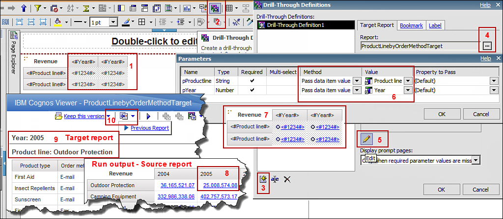
Figure 10.20. Set up parameters in the source report for drill through.
NOTE: Setting up drill through for the measure will enable the users to call the target report by clicking on the measures.
25. In the Drill-Through Definitions window, click the New Drill-Through Definitions icon on bottom left > in the Target Report tab > Report ellipses to select the target report.
26. Locate the ProductLinebyOrderMethodTarget report you created earlier.
27. In the Parameters section, click the Edit (pencil) icon.
28. In the Parameters window, for Productline change the Method column to Pass data item value > Value to Product line.
NOTE: You use the option Pass data item value because you want to pass the value of the selected data item in the Source report to the Target report. The values that you pass from the Source report is assigned to the two parameters you created in the target report, for example, ?pYear? and ?pProductLine?. The parameter values are then used to filter the data in the target report and keep context.
29. In the Parameters window, for pYear change the Method to Pass data item value and Valueto Year > click OK > click OK again.
NOTE: The measure intersections now appear as a link.
30. Run the report > click the cell intersection for Outdoor Protection for year 2005.
31. This opens the Target report ProductLinebyOrderMethodTarget that displays data for Outdoor Protection for year 2005.
32. Click the left arrow icon > Previous Report to return to the Source Report.
33. Save the report.
Drill Through from a Package
In IBM Cognos Connection, you can set up drill-through access for a package, which enables users to drill through from a source report that was created using the package to the target report. You can create multiple drill-through definitions for a package; however, each package drill-through definition can have only one target report.
This type of drill through is helpful because you can drill through the target report from many different reports created using the same package. So you do not need all the source reports created and in place before you can create the drill-through definition.
To create package drill through, perform the steps outlined in Figure 10.21 and described in the list that follows.

Figure 10.21. Set up package drill through in Report Studio.
1. In Cognos Connection, click Launch > Report Studio.
2. In the Select Package window, select Sales and Marketing (query).
3. In the New window, select List report output type > click OK.
4. Expand Sales (query) > expand Products > drag and drop Product line, Product type to the List.
5. Expand Time dimension > drag and drop Year to the List.
6. Expand Sales fact > drag and drop Quantity to the List.
7. Click Year > click Section/Unsection on the Standard Toolbar.
8. Click Product line > click Group/Ungroup on the Standard Toolbar.
9. Click the Filters icon on the Standard Toolbar > choose Edit Filters....
10. In the Filters window, click the Add icon.
11. In the Create Filter window, choose Advanced > click OK.
12. In the Detail Filter Expression window, navigate to Data Items tab > drag and drop Year in theExpression Definition section > at the end of expression type =?pYear? > Validate (refer to Figure 10.21).
13. In the Prompt window, type 2005 > click OK > click OK again > click OK again.
14. Save the report as SalesandMarketing_ProductsSoldAllYearsTarget.
15. In Cognos Connection, click Launch > click Drill-through Definitions.
16. Locate and click the package Go Data Warehouse (query).
17. Click the New Drill-through Definitions icon on the top right.
18. In the New Drill-through Definitions wizard window, type the name Drill-through toSalesandMarketing_ProductsSoldAllYearsTarget > click Next.
19. Click Set Scope link > choose Select an item > Sales and Marketing (query) > Sales (query) > Time dimension > Year > click OK.
NOTE: This restricts the drill-through definitions to reports that have a Year column.
20. Click Set the target > Select a report... > locate and selectSalesandMarketing_ProductsSoldAllYearsTarget > click OK > click Next.
21. In the Parameter mapping section > Source metadata item column > click map to metadata link (or the pencil icon).
22. Click Select an item > expand Sales and Marketing (query) > Sales (query) > Timedimension > Year > click OK > click Finish.
23. In Cognos Connection, click Launch > Query Studio.
24. Select GO Data Warehouse (query) package.
25. Expand Sales and Marketing (query) > Sales (query) > Products > click Product line > click Insert button from Time dimension > click Year > click Insert button.
26. Right-click Product line for year 2005 > Go To... > Related links....
27. Click SalesandMarketing_ProductsSoldAllYearsTarget and the report output displays data for 2005 only.
BURST REPORTS
Burst functionality enables you to distribute data from a single report to users or groups of users where each recipient/group sees only the subset of data to which they should have access to or that is relevant to them.
Reports can either be burst and distributed to users/groups/roles/distribution lists/contacts by email or saved to a folder in IBM Cognos Connection. You can burst the report as HTML, PDF, and XLS outputs only because CSV and XML outputs are not supported. Crosstab or Chart cannot be burst unless it is included in a container that is part of a Master Detail Relationship.
Bursting the report is a four-step process:
1. Identify and define the burst recipients, that is, who will receive the report.
2. Specify burst groups, that is, which data item in the report will be used to create separate reports.
3. Specify burst options in Report Studio.
4. Enable bursting in Cognos Connection.
The sections that follow describe each step in more detail.
Burst Reports Step 1: Identify and Define Burst Recipients
You should know the users who you will distribute the reports to. These users can be part of groups, roles, distribution lists, or contacts. Burst recipient here refers to the data item in the report that is used to determine who will receive the report when it is burst. The goal of this step is to ensure that the users identified to receive the report have a way to receive the report either by email or by accessing it within Cognos Connection.
You can burst the report to directories, email, or both. Although typically the email addresses are stored and available in the authentication source, you may also choose to use it from a database table by including it in the package, type the email address manually, create a calculated data item in Report Studio report that has the email address of the user, or use it from the custom burst table that has been included in the package.
If you decide to use the burst table, you must import the burst table in the package and define the relationship between the burst table and the table containing the data item on which to burst, for example, if you are bursting on country or region code. You define a relationship between country or region code in the burst table and country or region code in the Country or Region table. After the relationship is defined, you can publish the package for the report authors.
Burst Reports Step 2: Specify Burst Group
After the burst recipients have been defined, you must then specify the burst group. Burst group refers to the data item that you want to use to divide the data in the report before distributing. You must group the data in the report on the data item you choose to use as the burst group. For example, if you want to distribute a report by department where each department head gets data in the report for their department only, you must group the report on department.
Although you typically group the data on a data item in the report, you can also add it from the burst table to specify the data item to use for dividing the report content prior to distribution.
As mentioned earlier the burst report must be a grouped report; however, if the report is grouped on multiple columns, the burst is restricted to the outermost grouping in the report.
Burst Reports Step 3: Set Burst Options in Report Studio
In the report you want to burst, you must specify the Burst Options. You can set the Burst Options in Report Studio from File menu > Burst Options.... In the Burst Options window, you must select theMake report available for bursting check box. You also need to specify the Burst Groups andBurst Recipients.
The Burst Group option is used to specify how data should be divided in the report prior to distribution. The options are as follows:
• Query selects the query that has the data item to burst the report on.
NOTE: If you want to use the bursting option to distribute the same report to all recipients, you can select a query that is not part of the report layout.
• The Label option enables you to specify how the reports should be labeled in the Cognos Connection portal. By default the grouped data item will be used to name the reports if you do not choose any option; however, you can choose a data item from the drop-down list that is appropriate in your situation. For example, if you use a department as the Label, the report will be created for each department, for example, Finance, Marketing, HumanResource, and so on. You can also choose to use the burst key as a burst label depending upon your requirement.
• Groups option enables you to specify the grouped column to use for bursting, for example, department.
The Burst Recipient option is used to specify who will receive the report when it is burst. The options are as follows:
• Query refers to the query that contains the data item with Burst Recipient information.
• The Data Item option enables you to specify which data item should be used for the burst recipient, that is, the data item that has email addresses for distribution by email.
• The Type option enables you to specify the burst recipient type and choose from one of the three values, that is, Automatic, Email addresses, and Directory entries. Use Email addresses when you distribute the report by email only. If you require emailing the reports as well as bursting to Cognos Connection portal, you must choose Directory entries instead.
• The Master Detail Relationships option enables you to define the master detail relationships between two nested data containers, for example, a List and a Crosstab.
Burst Reports Step 4: Enable Bursting in Cognos Connection
After all the previous steps have been completed, you can burst the report by running it from Cognos Connection. You can either run the report immediately or schedule it to run later. Refer to Chapter 3, “Explore IBM Cognos Connection,” for details on how to schedule a report to run later. The options available here are the same as you have seen before. You can choose to either email the report as an attachment or send the link to the report that will allow users to log in to IBM Cognos Connection and view the reports in Cognos Connection.
Use the Run with Options and then in the Bursting section, you must select the Burst the reportcheck box. You should select all the relevant options, for example, select the check box for Send report by email to distribute reports via email.
Although the typical usage of the Burst option is to distribute the report with relevant data to different users, you can also work around to use this to distribute the report to everyone by bursting the report on a query that is not part of the report layout.
Steps to Burst a Report
This section brings together all of the steps of bursting a report described in the previous sections. Perform the steps shown in Figure 10.22 and described in the steps that follow.
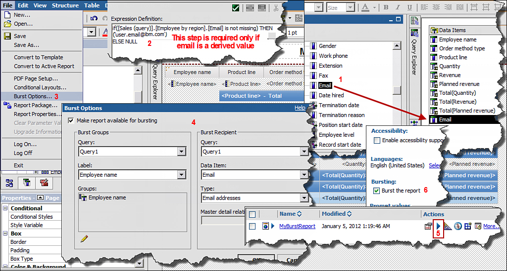
Figure 10.22. Set up burst options to burst a report.
1. In Cognos Connection, click Launch > Report Studio.
2. In the Select Package window, select GO Data Warehouse (query).
3. In the New window, select List report > click OK.
4. In the Insertable Objects pane, expand Sales and Marketing (query) > Sales (query) >Employee by region > drag and drop Employee name to the List.
5. Expand Products > drag and drop Product line to the List.
6. Expand Order method > drag and drop Order method type to the List.
7. Expand Sales fact > drag and drop Quantity, Revenue and Planned Revenue.
8. Ctrl+Click Employee name and Product line > click Group/Ungroup icon on the Standard Toolbar.
9. Ctrl + click Quantity, Revenue, Planned Revenue > Summarize > Total.
10. Double-click Page header > type MyBurstReport.
11. Run the report and validate the output.
12. Navigate to the Query Explorer > Query1.
13. From the Source tab > Employee by region > drag and drop Email to the Data Items pane(refer to Figure 10.22).
14. Next, set the burst options by clicking the File menu > Burst Options.
15. In the Burst Options window, enable bursting by selecting the Make report available for bursting check box.
16. In the Burst Groups section > Query section > select Query1 from the drop-down list.
17. In the Burst Groups section > Label section > select Employee name data item from the drop-down list.
18. In the Burst Groups section > Groups section > click the Edit (pencil) icon > double-clickEmployee name > click OK.
NOTE: This adds the grouped column to the Groups folder.
19. In the Burst Recipients section > Query section > select Query1 that is, the query that has email addresses or the burst recipients’ data item.
20. In the Burst Recipients section > Data Item section > select Email.
21. In the Burst Recipients section > Type section > select Email addresses > click OK.
NOTE: When you choose email addresses, the email address must be available in the burst key, that is, the data item specified in the Data Item section in step 20.
22. Save the report as MyBurstReport.
23. In Cognos Connection, in the Actions column for MyBurstReport report, click the Run with Options icon.
24. Click the Advanced Options link > select Run in the background > specify the date and time.
25. In the Options section > Bursting > select the Burst the report check box.
26. In the Delivery section > select the Send report by email check box > click Edit the options link... > type in a message > click OK.
NOTE: You can select the Include a link to the report check box to include the report link in the email. Also select Attach the report check box to attach the report to the email for users who do not have access to IBM Cognos BI. Also, the email recipients are determined by the burst specification you have defined.
27. Optionally, to send report to mobile users, select the Send the report to mobile recipientscheck box > click the Select the recipients... link to add mobile recipients > click the RUN button > click OK > click Close.
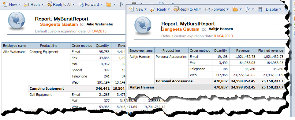
Figure 10.23. Burst report distributed to users with their portion of the data.
WORKING WITH CHARTS
In IBM Cognos BI v10, you can choose to work with the legacy Cognos 8 charts or use the new improved charting engine available in Cognos BI v10. If you are new to working with charts, you may want to first review the “Working with Charts” section in Chapter 9 and review the different chart types as well as steps on how to create charts.
By default, the new Cognos 10 charting engine is used; however, if you want to continue to use the Cognos 8 charting engine, you can do so in Report Studio > click Tools > Options > Advanced tab > select the Use legacy chart authoring check box > click OK. You will notice that when you work with Cognos 10 charts there are additional options available to you in the Properties pane.
In addition to some new chart types available in Cognos 10, new chart properties are available like the enhanced chart styles (palettes, colors, fills, drop shadows, and images), colored regions, greater control over Legend positioning, enhanced pie/donut charts, summarizing small items, Positioning and Formatting notes, chart matrix layout control, and conditional formatting of items in the legend.
You can use the new toolbar buttons in Page Layout to insert a table using a predefined layout, Background Effects to apply background effects to the chart, or any other selected object. The following examples highlight the new features and guide you through the steps to use them effectively.
One of the options available in Cognos 10 charts is the Summarize small items option, which can be used in Pie, Bar, and Column charts. It can be used to focus data on top n reports, for example, the top three product lines.
Steps to Create a Column Chart
To create a column chart, perform the steps outlined in Figure 10.24 and described in the list that follows.

Figure 10.24. Create a column chart.
1. In Cognos Connection, click Launch > Report Studio.
2. In the Select Package window, select GO Data Warehouse (query).
3. In the New window, select Chart > click OK.
4. In the Insert Chart window, select Column (Clustered Column) > click OK.
5. In the Source tab, expand GO Data Warehouse (query) > Sales and Marketing (query) >Sales (query) > Products > drag and drop Product line to Series (primary axis).
6. Expand Sales fact > drag and drop Revenue to Default measure (y-axis).
7. Expand Time > drag and drop Year to Categories (x-axis).
8. Run the report.
9. Click the Chart > in the Properties pane > Chart Titles section > Title > change to Show > double-click the title and type Revenue by Product Line – Trend Report.
10. Click the bar (Product line in the Series) > in the Properties pane for the Bar > General section > Series Type > change to Stacked.
11. In the Properties pane > General section > Bar Shape > change to Cylinder.
12. In Properties pane > General section > Bar Width > change to 50.
13. Run the report.
14. In the Properties pane > Color & Background section > Palette > click the ellipses > in thePalette window > click Chart Palette Presets (the drop-down icon under Entries tab) > select Excel 2007 style palette > click OK (refer to Figure 10.24).
15. Click the Chart > in the Properties pane > Chart Annotations section > Legend > click theellipses > in the Legend window Preset section > click Bottom > click OK.
16. Run the report.
17. Save the report as Revenue by Product Line Trend Report. You will use it in the upcoming exercise.
Convert to Another Chart Type
To convert the column chart you just created to another type of chart (pie chart, for example), perform the steps outlined in Figure 10.25 and described in the list that follows. This example builds upon theRevenue by Product Line Trend Report created in the previous example.
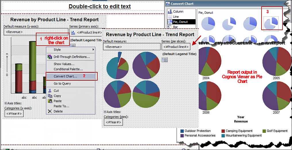
Figure 10.25. Convert chart from column to pie.
18. If not already open, open Revenue by Product Line Trend Report.
19. Click Chart > right-click and select Convert Chart... > select Pie, Donut > Exploded Pie with 3-D Effects > click OK.
21. Click the Year (in Categories) > Delete.
22. Run the report and notice the additional slices for each year have now been removed.
23. To change to donut, click the Chart > in the Properties pane > General section > Hole Size > change to 50%.
24. Run the report.
25. Save the report as Revenue by Product Line Donut.
Sort Data in the Chart
In this exercise you sort the values in a column chart, so the bars appear in ascending or descending order, as required. This makes the chart easy to read, especially when multiple bars are similar in size. You use the chart created in the previous example and convert it to a column chart to complete this exercise.
1. If not already open, open Revenue by Product Line Donut.
2. Click Chart > right-click and select Convert Chart...> select Column > Clustered Column >click OK.
3. Run the report; notice the bars are not sorted in ascending or descending order.
4. Click Product line in the Series (the Properties pane should show Chart Node Member) > in theProperties pane > Data section > Sorting > click the ellipses > in the Sorting window > Data items pane double-click Revenue to move it to the Sort list section > click OK.
NOTE: You can change the sort order to descending by using the Sort Order option available in the Sorting window or by double-clicking Revenue in the Sort List pane.
5. Run the report.
6. Save the report as Revenue by Product Line Column Sorted.
Exploding a Pie Slice in a Pie Chart
Use the Exploded Slices property in the General section of the Chart property to specify which slice to explode.
In the Exploded Slice window you can specify the following properties:
• The Exploded amount option enables you to specify a value (in percent) as how far the exploded slice should appear from the rest of the pie. For example, a value of 100% will display the exploded slice as far from the pie as possible.
• The Exploded slice > Slice number option enables you to specify which slice to explode. The number should correspond to a slice in the legend. For example, if Camping Equipment is the first slice displayed in the legend, to explode Camping Equipment type 1 and so on. To explode multiple slices, you must click the New icon and create a specification for each slice.
• The Exploded slice > Expression option enables you to select a slice to pull out using an expression. The following example uses an expression to pull out the pie slices.
To Explode slices in a chart, perform the steps outlined in Figure 10.26 and described in the list that follows.

Figure 10.26. Explode slices in a pie chart.
1. In Cognos Connection, click Launch > Report Studio.
2. In the Select Package window, select GO Data Warehouse (query).
3. In the New window, select Chart > Pie/Donut > Exploded Donut with 3-D Effects > clickOK.
4. In the Source tab, expand Sales and Marketing (query) > Returned items (query) >Returned items fact > drag and drop Return quantity as Default Measure.
5. Expand Products > drag and drop Product line as Series (pie slices).
6. Run the report.
7. Click the Chart > right-click and choose Go to Query.
8. From the Toolbox tab, drag and drop Data Item to the Data Items section on the right.
9. In the Data Item Expression window > in the Available Components pane navigate to the Data Items tab > drag and drop [Return quantity] to the Expression Definition section > type / > navigate to the Functions tab > expand Summaries folder > drag and drop Total to the Expression Definition section. Then navigate to the Source tab > from Sales fact drag and drop Quantity at the end of the expression > type for report) > click OK.
NOTE: Your expression should like this: [Return quantity]/total ([Sales (query)].[Sales fact].[Quantity] for report).
10. Click the new Data Item > in the Properties pane > Data Item section > Name > type%Returns.
11. Click Page Explorer > Page1 and navigate to the report layout.
12. In the chart, click Product line (Series pie slices) > in the Properties pane > Data section >Properties option > click the ellipses > in the Properties window > select the %Returns check box > click OK.
NOTE: By doing this you included the data item as part of the query and allow the layout to reference an item in the query that is not otherwise available.
13. Click the Chart.
14. In the Properties pane > General section > Exploded Slices > click the ellipses (refer toFigure 10.26).
15. In the Exploded Slices window > click the existing slice definition expression > select Delete.
16. In the Exploded Slices window, click the New icon > select the Expression radio button > click the ellipses.
17. In the Report Expression window from the Available Components pane, drag and drop%Returns to the Expression Definition section. At the end of the expression, type < .002 and click Validate > click OK > click OK > click OK again.
18. Run the report.
19. Click the Chart > in the Properties pane > Chart Labels section > Show Values > click theellipses.
20. In the Show Values window > Show section > uncheck both Slice names and Show leader lines > in the Values section > select Percentage from the drop-down > click OK.
21. Run the report.
22. In the Show Values window > Show section > uncheck Slice names > select the Show leader lines check box> in the Values section > select Percentage from the drop-down > click OK.
23. Run the report.
24. In the Show Values window > Show section > select both check Slice names and Show leader lines check box> in the Values section > select Percentage from the drop-down > click OK.
25. Run the report.
26. Save the report.
NOTE: You can now control how much information you want to display on the chart.
Summarizing Small Items
Using the Summarize Small Items property enables you to summarize the smaller slices or bars in the chart to avoid displaying too many values in the chart at the same time, making it unreadable. It is common that users want to focus on certain values while displaying the remaining items together as a separate category of Other.
To summarize the small items in the chart, you should select the Chart > in the Properties pane for the chart > in General section > Summarize Small Items > click the ellipses. From here you can specify how many slices you want to display. The rest of the slices will be summarized into the Othercategory.
To summarize small items in a chart, perform the steps outlined in Figure 10.27 and described in the list that follows.
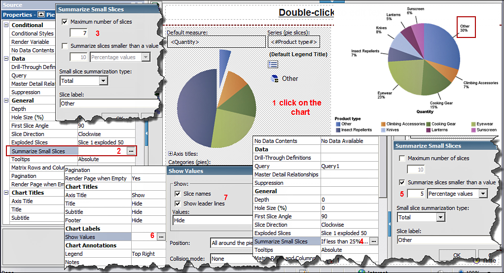
Figure 10.27. Summarize small slices in a chart.
1. In Cognos Connection, click Launch > Report Studio.
2. In the Select Package window, select GO Data Warehouse (query).
3. In the New window, select Chart > click OK.
4. In the Insert Chart window, select Pie/Donut > select Pie > click OK.
5. From the Source tab, expand Products > drag and drop Product type as Series (pie slices).
6. From Sales fact > drag and drop Quantity as Default measure.
7. Run the report.
NOTE: There are many Product types, and you may want to focus on those that contribute significantly and summarize the smaller values together to make the chart readable.
8. In Report Studio, click the Chart > in the Properties pane > General section > Summarize Small Items > click the ellipses.
9. In the Summarize Small Slices window, select the Maximum number of items check box > type7 > click OK (refer to Figure 10.27).
NOTE: In this case 7 Product types will be displayed with the 8th being Other. You can change the default label from Other to something more meaningful using the Slice label option in the Summarize Small Items window.
10. Run the report.
11. Click the Chart > in Properties pane > General section > Summarize Small Items > click the ellipses > uncheck Maximum number of items check box > select the check box Summarize slices smaller than a value > type 5 > click OK.
12. Click the Chart > in the Properties pane > Chart Labels section > click the ellipses > in theShow Values window Show section > select the Slice name check box > select Show leader linescheck box. In the Values > select Percentage from the drop-down list > click OK.
13. Run the report.
14. Save the report.
Bullet Charts
A bullet chart is a variation of bar charts and is commonly used to display actual versus target values, for example, Revenue versus Planned Revenue.
To create bullet charts, perform the steps outlined in Figure 10.28 and described in the list that follows.

Figure 10.28. Create Bullet charts in Report Studio.
1. In Cognos Connection, click Launch > Report Studio.
2. In the Select Package window, select GO Data Warehouse (query).
3. In the New window, select Chart > Bullet > Horizontal Bullet > click OK.
4. From the Source tab > Sales fact > drag and drop Revenue as Bullet Measure (refer to Figure 10.28).
5. From the Source tab > Sales fact > drag and drop Planned Revenue as Target Measure.
6. Click the Chart > in the Properties pane > Positioning section > Size & Overflow > click theellipses > change Height to 200 > change Width to 600 > click OK.
7. Run the report.
8. From the Source tab > expand Products > drag and drop Product line as Series (matrix rows).
9. Click the Chart > in the Properties pane > General section > Matrix Rows and Columns > click ellipses.
10. In the Matrix Rows and Columns window > uncheck the Wrap rows and columns if possiblecheck box.
NOTE: This allows you to display each bullet in a separate row.
11. Run the report.
12. Save the report.
EXTERNAL DATA
Refer to the “External Data” section in Chapter 9 for more information about working with external data.
WORKING WITH DIMENSIONAL REPORTS
Chapter 9 covers concepts on working with dimensional reports. If you are new to dimensional reporting, is it recommended you review Chapter 9 to become familiar with the concepts to enhance your learning experience.
You can create reports by using root level members, levels, and members depending upon your reporting need.
When working with dimensional data in a Crosstab report, you can automatically add header labels in rows and columns. The headers help the report consumer to understand where the data is in the hierarchy. The labels are added to new sets only, and existing sets are not impacted. You can enable this feature via the Tools menu > Options > Report tab > Automatically create crosstab headers for sets check box.
Understand Members, Member Unique Names, Sets, and Tuples
A Member typically refers to the row of data from the data source. A member is uniquely identified by a member key, and the member caption is the name that is used to refer to the member. The other information pertaining to the member is additional descriptive information and is referred to as member attributes.
Member Unique Names (MUNs) play an important role when working with dimensional data. As the name suggests it uniquely identifies a member and provides the path of the member in the dimensional structure. You must understand and appropriately handle MUNs because when MUNs change, it may have a negative impact on the report functionality. For example, MUNs are used to drill through to another report as it is passed as a parameter from the source report, so if the MUN changes, that is, the member’s location in the dimensional structure, the parameter passed may be incorrect resulting in a broken report.
A Set consists of a group of one or more members from a single hierarchy. A simple example of a set would be when you drag and drop a level to a row or column of a Crosstab report, the members in the row or column from the same hierarchy constitute a set.
Tuples refers to the measures in the intersection cells of a Crosstab, as shown in Figure 10.29. The value 17846021 constitutes a tuple of Web, 2007, and Quantity.

Figure 10.29. Set and tuples in a crosstab.
Working with Set Functions
When working with dimensional data, you always work with Sets and Tuples. To work with selected members you can use the Set function to restrict the report to selected members.
To use selected members with the Set function, perform the following steps:
1. In Cognos Connection, click Launch > Report Studio.
2. In the Select Package window, select GO Data Warehouse (analysis).
3. In the New window, select Crosstab > click OK.
4. Expand Sales and Marketing (analysis) > expand Sales > Products > Products > drag and drop Product line as Rows.
5. Expand Sales fact > drag and drop Quantity as Measures.
6. Expand Time dimension > Time > drag and drop Year as Columns.
7. Navigate to the Query Explorer > Query1 > from the Toolbox tab > drag and drop a Slicer member set to the Slicer section on the right.
8. In the Slicer Member Expression window > navigate to the Functions tab > expandDimensional Functions > expand R-Z folder > double-click Set.
9. Navigate to the Source tab > expand Order method dimension > Order method > Members folder > Order method > double-click Fax > type ) > click Validate > click OK.
NOTE: You can add an additional Order method type, for example, set ([Fax], [Telephone]).
10. Run the report.
NOTE: The data is displayed only for Fax. If you have any blank columns in the output, you can suppress the empty rows and/or columns using the Suppress icon on the Standard Toolbar.
11. You can add additional Slicers by dragging and dropping the Slicer member set to the Slicer section as long as they are from different dimensions. You can use any available dimensional functions from the Functions tab > Dimensional Functions folder to build the Set expression, discussed later in this section.
Filtering Dimensional Data
You can filter data in a dimensional report by using Context filters or by using the filter function. In addition, you can filter the data in the report based on user input using Prompts and Prompt Controls.
When working with dimensional data, Context filters or Slicer filters are commonly used to focus the data in the report. These filters require dimensionally modeled data.
Context Filters
To create Context filters drag and drop data items from the Source tab to the Context Filters section in the Overview area.
You can define prompts in the report using the Context filters and allow users to provide input when they run the report, as shown in Figure 10.30.
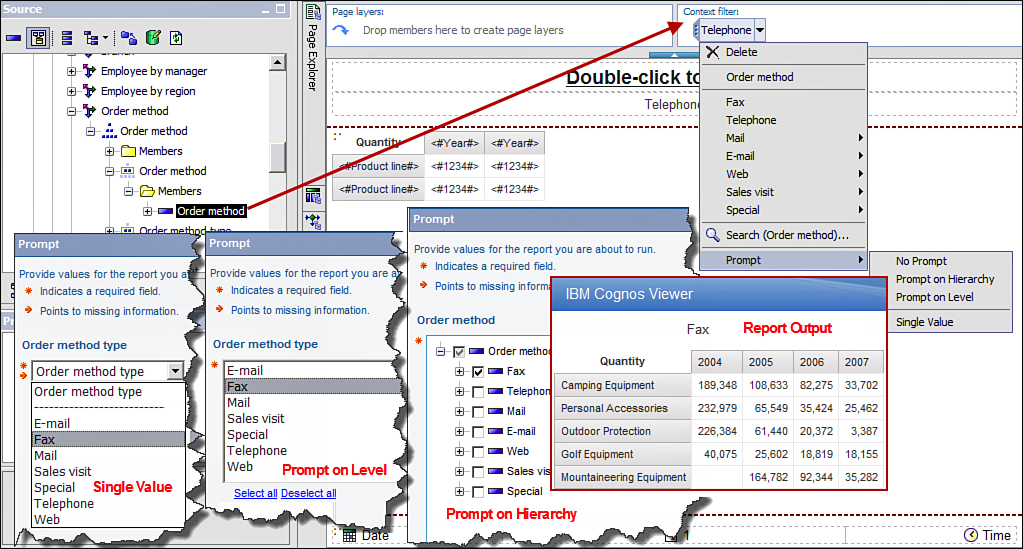
Figure 10.30. Using prompts with Context filters.
To create a prompt using Context filter, click the Context filter drop-down > Prompts. There are four options you can choose from:
• No Prompt is the default where the user is not prompted for a value when the report is run.
• Prompt on Hierarchy enables users to select one or more members from the hierarchy using a tree prompt, when the report is run.
• Prompt on Level enables users to select one or more members in the current level using a multiselect prompt.
• Single Value enables users to select a single value from the drop-down list using a prompt.
Following are the steps to use Context Filters:
1. In Cognos Connection, click Launch > Report Studio.
2. In the Select Package window, select GO Data Warehouse (analysis).
3. In the New window, select Crosstab > click OK.
4. Expand Sales and Marketing (analysis) > expand Sales > Products > Products > drag and drop Product line as Rows.
5. Expand Sales fact > drag and drop Quantity as Measures.
6. Expand Time dimension > Time > drag and drop Year as Columns.
7. In the Source tab > expand Order method > Order method > Order method type >members folder > drag and drop Telephone to the Context filter section (top right) in report layout.
8. Run the report.
Slicer Filters
Slicers like Context filters work with dimensionally modeled data only. They operate using the set functions available only in dimensionally modeled data. Using the Context filter in the report page yields the same result as when you use a slicer in an expression.
When working with expressions and calculations, you can define the scope of the data set using the slicer member set. Use a Slicer member set when you want to specify the context of the expression to certain set of members from the same dimension. The result affects the values in the cell and not on the row or column values. You can use more than one slicer if they are from different dimensions. You cannot have more than one slicer from the same dimension.
A typical example to use a slicer member set would be to get the top or bottom 10 members from a dimension.
Steps to Use Selected Members with the Set Function and Slicer
To use a Slicer filter to filter a dimensional report data, perform the steps outlined in Figure 10.31 and described in the text as follows.
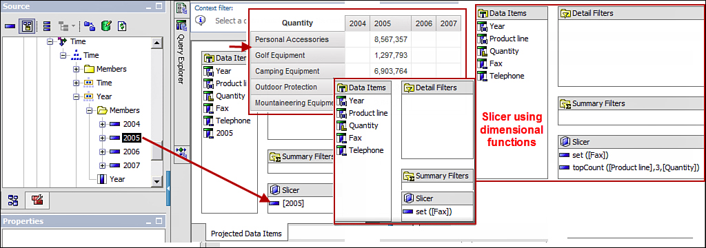
Figure 10.31. Use Slicers to filter dimensional data.
1. In Cognos Connection, click Launch > Report Studio.
2. In the Select Package window, select GO Data Warehouse (analysis).
3. In the New window, select Crosstab report output type > click OK.
4. Expand Sales and Marketing (analysis) > expand Sales > Products and drag and dropProduct line as Rows.
5. Expand Sales fact > drag and drop Quantity as Measures.
6. Expand Time > Time > drag and drop Year as Columns.
7. Navigate to the Query Explorer > Source tab > Time dimension > Time > Year > Members folder > drag and drop 2005 to the Slicer section on the right, as shown in Figure 10.31.
8. Run the report.
NOTE: The data is displayed only for 2005. The other year columns are blank; you can suppress the empty rows and/or columns using the Suppress icon in the Standard Toolbar.
9. Drag and drop 2006 to the Slicer section on the right.
10. Run the report.
NOTE: You get an error that slicers must come from different dimensions.
11. Undo to remove 2006 from the Slicer.
NOTE: You can add Slicers by dragging and dropping Slicer Member Set from the Toolbox tab, for example, topCount() to the Slicers section on the right to get the top n in the result. To build the Set Expression, you can use dimensional functions from the Functions tab > Dimensional Functionsfolder.
Filter Using Prompts
You can filter the data in the report by defining prompts for rows or columns in the Crosstab using the Expression Editor. A multiselect prompt is generated using this method. You can Ctrl+Click values you want to display in the report.
To filter report data by using prompts, perform the steps outlined in Figure 10.32 and described in the list that follows.

Figure 10.32. Filter multidimensional data using prompts.
1. In Cognos Connection, click Launch > Report Studio.
2. In the Select Package window, select GO Data Warehouse (analysis).
3. In the New window, select Crosstab > click OK.
4. In the Insertable Objects pane, expand Sales and Marketing (analysis) > Sales > Order method > Order method > Order method type as Rows.
5. Navigate to the Toolbox tab; drag and drop a Query Calculation as Columns.
6. In the Create Calculation window, type year_calc > select Set expression > click OK.
7. In the Set Expression window > Available Components pane > navigate to the Functions tab > expand the Dimensional Functions folder > expand R-Z folder > double-click set > navigate to theSource tab > expand Time > Time > drag and drop Year to the Expression Definition section > type ->?yr?) > click Validate select a year value from the list generated by validate > click OK if no errors.
8. Expand Sales fact > drag and drop Quantity as Measures.
9. Run the report.
10. In Cognos Viewer, Ctrl+Click and select 2005, 2006 > click OK.
Commonly Used Dimensional Functions
You can choose from a variety of dimensional functions available to you depending upon your reporting requirements.
• Dimensional Functions can be categorized as Set Functions, Family Functions, Relative Functions, and so on.
• Set Functions enable you to work with sets in the report. Example Set Functions include
Set([Fax])
Set([Fax],[Telephone])
You can choose from a rich selection of set functions such as subset, siblings, topCount, bottomCount, topPercent, and so on.
• Family Functions enable you to specify which value you want to work with from the dimensional structure, for example, ancestor, children, cousin, siblings, firstChild, firstSibling, lastChild, lastSibling, parent, and so on.
Example Family Functions include
children ([Retailers]) would return Americas, Asia Pacific,
Northern Europe, Southern Europe and Central Europe
parent ([Fax]) would return Order method
parent([United States]) would return Americas
• Relative Functions enable you to specify a value relative to a value in the dimensional structure enabling you to navigate through the dimensional structure, for example, currentMember, prevMember, and so on. Example Relative Functions include
previousMember([Products]) where [Products] is a member in the
dimensional structure
nextMember([2005]) where [2005] is a member in the dimensional
structure
Similarly you can use lead and lag functions. With lead and lag functions, you need to specify relative position from a member in the dimensional structure.
When you use relative function, for it to work correctly the data must be sorted when you model in Framework Manager.
• Relative Time Related Functions enable you to specify a value in the dimensional structure relative to a member position, for example, closingPeriod, openingPeriod, parallelPeriods, periodToDate, and so on.
Drill-Through Reports
Drill-Through options work in a similar way as discussed earlier. When working with dimensional reports, you can choose the level you want to drill through from the source report to the target report. For example, you can either drill through from a member in the source report to the member in the target report (member-to-member) or choose to drill through at the hierarchy level rather than the member level. The process for defining either of the two options is the same; the only difference being that when defining the prompt for the parameter to be passed, you should use the appropriate level.
Choose the drill through to hierarchy when you want to allow users to drill through from a member at any level in the hierarchy. The steps to set up the drill-through is similar to member-to-member, other than you need to choose a hierarchy level when creating the parameter rather than a level.
Steps to Set Up Member-to-Member Drill-Through
To set up a member-to-member drill-through, you first create the target report and specify the column that will be used to accept the filter value from the source report. Next, create the source report and use the target report name and column filter defined in the target report in the drill-through definitions. Perform the steps outlined in Figure 10.33 and described in the list that follows.
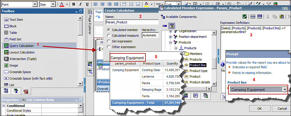
Figure 10.33. Set up member-to-member drill-through.
1. In Cognos Connection, click Launch > Report Studio.
2. In the Select Package window, choose GO Data Warehouse (analysis).
3. In the New window, select List > click OK.
4. Expand Sales and Marketing (analysis) > expand Sales > Products dimension > Products > drag and drop Product line level and Product type to the List.
5. Expand Sales fact > drag and drop Quantity.
6. Navigate to the Toolbox tab; drag and drop a Query Calculation to the list as the first column.
7. In the Create Calculation window, type Param_Product for Name > click OK.
8. In the Calculated Member Expression window, navigate to Products > drag and drop Product line to the Expression Definition section and at the end type ->?paramproductline? (refer toFigure 10.33).
9. In the Expression Definition section, click Validate.
10. In the Prompt window, select Camping Equipment from the Product line drop-down list > click OK > and if No errors, then click OK > close Cognos Viewer.
11. Navigate to the Toolbox tab, drag and drop a Layout Calculation above the List > in the Report Expression window, navigate to the Parameters tab > double-click paramproductline (refer toFigure 10.34). Then click Validate > click OK > Run the report.
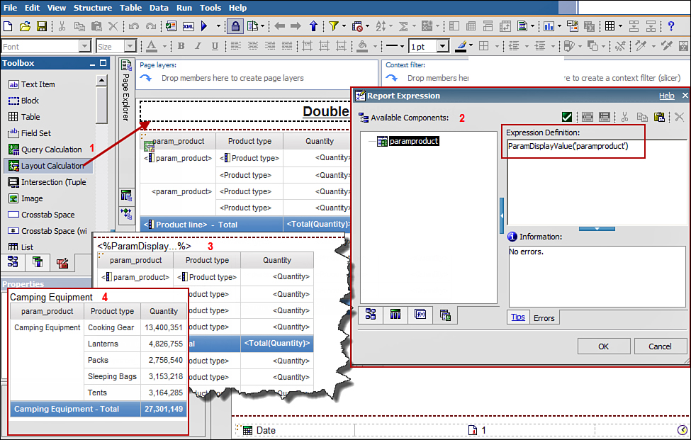
Figure 10.34. Display Parameter values using Layout Calculation.
NOTE: This enables you to display the parameter value in the report. Notice that Camping Equipment is displayed on top of the List in Figure 10.34.
12. Save the report as Products_DrillThru_Target.
13. In Cognos Connection, click Launch > Drill-through Definitions.
14. Navigate to the folder that has the package, Public Folders > Great Outdoor Samples >Samples > Models > GO Data Warehouse (analysis).
15. Click New Drill-through Definition icon (on top right) > in the Specify a name and descriptionwindow > type Product_Member2Member_DrillThuDefinition > click Next.
16. In the Specify scope and target window > click the Set the scope... link, as shown in Figure 10.35.
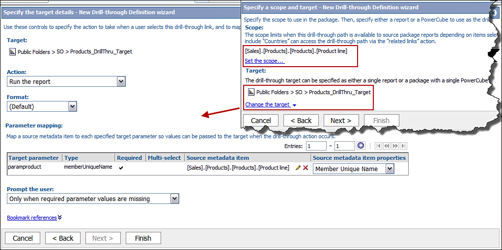
Figure 10.35. Set up drill-through definitions.
17. In Set the scope window > navigate to Sales and Marketing (analysis) > Sales > Products > Product line > click OK.
18. In the Specify a scope and target window > Target section > click Set the target > choose Select a report... > Products_DrillThru_Target > click OK > click Next.
19. In the Specify target details window > in the Parameter mapping section > Source metadata item column > click the Map to Metadata link to set the value.
20. In the Select an item window > navigate to Sales > Products > Product line > click OK.
21. In the Specify the target details window > Parameter mapping section > Source metadata item properties column > from the drop-down list choose Member Unique Name > click Finish.
22. In Report Studio, click File > New to create the source report > select List > click OK.
23. From the Insertable Objects pane, Products > drag and drop Product line to the List.
24. Expand Order method > drag and drop Order method type.
25. Expand Sales fact > drag and drop Revenue.
26. Click Product line > click Group/Ungroup in the Standard Toolbar.
27. Click the Data menu > Drill Behavior... > ensure Allow this report to be a package-based drill-through source check box is selected > click OK.
28. Run the report.
29. In Cognos Viewer, right-click Camping Equipment and select Go To > Related Links. From the Go To window, click Product_Member2Member_DrillThruDefinition and the target report is displayed with data for Camping Equipment only.
MAPS
Create map reports in Report Studio by using the Map report output type and display data in spatial or geographical context using maps. You create the map reports using predefined maps available in the IBM Cognos BI environment. IBM Cognos does not by itself create maps however; it enables you to use maps that are created by map applications such as ESRI and MapInfo. You can also embed Google Maps with Cognos reports using JavaScript and Cognos Mashups.
You can import maps from other tools such as MapInfo into Cognos using the File > Import menu option in Map Manager. Map Manager is a Windows-based application and is installed as part of the IBM Cognos BI software install. The default maps are located in the Cognos BI install_location/maps directory. To use maps from other vendors, you must first convert those maps to MapInfo and then import the MapInfo map format into IBM Cognos. To create your own maps, you can use applications such as ESRI to create the shapes you require. Map Manager is not used to create maps, rather to specify how it should handle the data available to it, for example, by using the dictionary to create aliases for any of the features on the map, and to add translations to the .cmf map file using the export/import option. In addition, Map reports enable you to display information on the maps based on the user’s run locale by matching its value to the map dictionary language in Map Manager. The changes in the Map Manager must be applied manually in every environment or each time the environment is upgraded.
The maps in IBM Cognos BI have been updated; however, the older versions of the maps can be used only after they are enabled by the Cognos BI Administrator.
To build map reports in Report Studio, you should specify the values for a combination of three layers, for example, Region layer, Point layer, and Display layer.
• Region layer: Use the Region layer to specify the regions on the map and display values from the data source. For example, use the Region layer to color code regions or areas on the map like Countries to compare the data across countries. You can have only one Region Layer per report. The Regions in the map are colored based on the value of a measure, for example, Quantity and Revenue. You can define what values determine the color code, for example, green for high revenues or sales and red for low revenue or sales.
When you use the Region layer in the report, you need to specify values for the following options:
• Color: Requires a measure value that will be used to drive the color of the regions in the map, for example, Revenue and Quantity.
• Location: Corresponds to the option you selected for Region layers, for example, Country or State and Provinces, drag and drop a data item from the Insertable Objects pane. It is a data item that corresponds to the type of region chosen.
• Color Legend Title: Specifies the text you want to display as the legend title. This is optional and by default corresponds to the data item dropped in the Color drop zone.
• Point layer: Used to specify the points (circles) on the map, for example, for cities, states, and so on. You can color code or size the points depending on a measure value. You can have only one Point layer per report. If required you can color code and/or size the points to meet.
The following options are available when working with Point layers; specify the values for those that you will be using:
• Color option requires a measure value, for example, in the Point layer to have a color of the point based on quantity.
• Size option enables you to map the size relative to the measure specified in Color option.
• Default drop an item here that you want to use as the default value. It should be a measure.
• Location option enables you to specify the location to use for display in the map, for example, State, Province, and Cities. The object must be supported in the map file as a location. For example, if you want to use City as a location, then city must be supported as a location in the map you choose to work with.
• Refine Location option enables you to uniquely define the Location value when repeated values appear:
• Color Legend Title specifies the text that appears as the legend title.
• Size Legend Title enables you to specify the size for the legend title.
• Display layer: Used to add context to the map. A report may or may not have a Display layer. You may choose to have more than one Display layer to add additional contextual information to the report. The properties of the Display layer enable you to control whether you want to show or hide the gridlines, cities, and so on. Options you specify are not data-based. You can use any Region or Point layer as the Display layer if the region or point layer is not already being used.
Although you have the options to use the three layers, it is not mandatory that you use all the three when defining the maps.
Steps to Create a Map Report
To create a Map report, perform the steps outlined in Figure 10.36 and described in the list that follows.
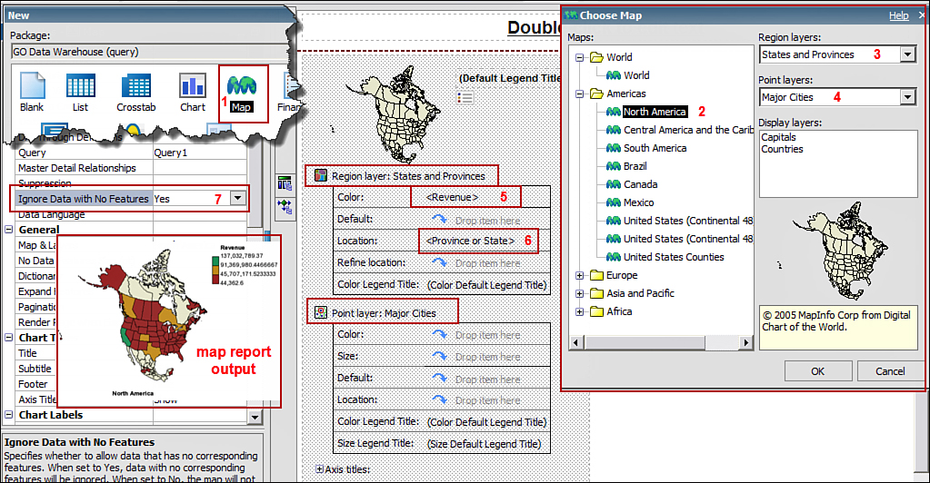
Figure 10.36. Create a map report for North America Revenue.
1. In Cognos Connection, click Launch > Report Studio.
2. In the Select Package window, choose GO Data Warehouse (query).
3. In the New window, select Map > click OK.
4. In the Choose Map window, Maps section > expand Americas > click North America (refer toFigure 10.36).
5. In the Region layers, select State and Provinces from the drop-down list.
6. In Point layers, select Major Cities from the drop-down list.
7. You do not want to use the Display layers, so leave it as is > click OK.
8. Run the report.
NOTE: You have not assigned any measures and so on, so the map is an empty map of North America. You will now assign values to display in the report.
9. Close Cognos Viewer.
10. In the Insertable Objects pane > Source tab, expand Sales and Marketing (query) >Sales (query) > expand Sales fact > drag and drop Revenue to the Color section.
NOTE: This is for the color in the Region layer.
11. Expand Retailers > drag and drop State or Province to Location section.
NOTE: Ensure a new entry Refine location is now displayed. The Refine location should be used only when the entries in Location are not unique, for example, if a city name can be in multiple state, you must use the Refine location option to make them unique.
12. Run the report.
NOTE: You will get an error The map chart data contains references to missing region names. Notice the cities listed in the error message and those from around the world and not just North America, which implies that the underlying query is pulling other cities also. You can fix this in the next step.
13. Click the map > in the Properties pane > Data section > change the value for Ignore Data with No Features to Yes.
14. Run the report.
15. To change your map options, click the Map > in the Properties pane > General section > Map & Layers > click the ellipses, as shown in Figure 10.37.
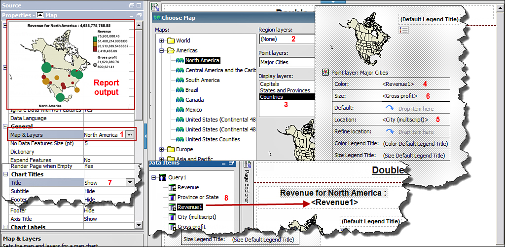
Figure 10.37. Update an existing map.
16. In the Choose Map window, change Region layers to None.
17. In the Choose Map window, Display layers > choose Countries > click OK.
18. From the Source tab, Sales fact > drag and drop Revenue to Color.
19. From the Source tab, Retailers > drag and drop City to Location.
20. Run the report.
21. From the Source tab, Sales fact, drag and drop Gross Profit to Size.
NOTE: The map now displays relative Revenue and relative Gross Profit.
22. Click the Point layer section in the map > in the Properties pane > Chart Labels section > select Show from the drop-down list.
NOTE: You can change the font size by clicking the map > Properties pane > Font & Text section > Font.
23. Run the report.
24. Click Undo to change the Chart labels property back to hide.
25. Click the map > in the Properties pane > Chart Labels > Tooltips > select Show from the drop-down list.
26. Click the map > in the Properties pane > Chart Titles section > Title > select Show from the drop-down list.
27. Double-click the map title in the map > type Revenue for NorthAmerica : > click OK > navigate to the Data Items tab > drag and drop Revenue at the end> Run the report.
28. Navigate to Query Explorer > Query1 > from the Toolbox drag a filter to the Detailed Filterssection > from Sales > expand Retailers > drag and drop Region > at the end of the expression type=‘Americas’ > Validate > click OK.
NOTE: This step illustrates that you can apply filters and other report-building techniques in a similar way when working with maps.
29. Navigate to Page Explorer > Page1.
30. Double-click the map title Revenue for North America : > change it to Revenue for Americas > click OK.
31. Click the <Revenue> in the map title > in the Properties pane > Data section > click Data Format > format type as Currency > Currency as $(USD) United States of America, dollar > click OK > Run the report.
32. Click the map > right-click > Choose Edit Map Type... > in the Maps section > expand World > select World.
33. In the Choose Map window, Regions layer > select Countries + Territories.
34. In the Choose Map window, Points layer > None.
35. In the Choose Map window, Display layer > Oceans > click OK.
36. From the Data Items tab > drag and drop Revenue as Color.
NOTE: If you create a new map, you may have to drag and drop items from the Source tab.
37. From the Source tab > expand Retailers > drag and drop Retailer country as Location.
38. Run the report.
NOTE: Examine how the edges merge with the white space. You can enhance the display using the display layer.
39. Navigate to the Query Explorer > Query1. Then Delete the filter you created earlier in the Detailed Filters section.
40. Navigate to Page Explorer > Page1.
41. Click Region layer: Countries + Territories > in the Properties pane > Color & Background section > Fill Effects > click the ellipses > in the Fill Effects window > click Color > click color box > select Gray (or a color of your choice) > click OK > Run the report.
42. Click the Display layer: Oceans > in the Properties pane > Color & Background section >Fill Effects > click the ellipses > in the Fill Effects window > choose Color > select Blue > click OK> Run the report.
43. Repeat step 42 > this time choose Gradient instead of Color > click From Color > select a dark shade of Blue > click To Color > select a light shade of Blue > click OK > Run the report.
44. Click the Region layer : Countries + Territories > in the Properties pane > in the Color & Background section > click Palette > click the colored box (on the right) to change the color using the box on left. Then click the numeric value on the left e.g. 33.33% > type 30 in the Percentage boundary box on the right > click 66.66% > change it to 70% by typing in the Percentage boundary box > click OK > Run the report (refer to Figure 10.38).
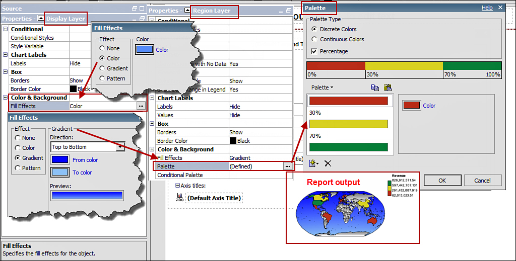
Figure 10.38. Use the Fill Effects and Palette to enhance the map report.
NOTE: You have defined that < 30% values are considered low values and are hence colored red; values in the range >= 30% and <70% are considered average and are colored yellow; whereas values >=70% are considered good and are colored green.
Add Custom Maps to Use in Cognos Report Studio
To use your custom maps in IBM Cognos environment, you should first create the maps you require using map applications such as MapInfo, ESRI, and so on. After you have created the maps, you can then include them for use in IBM Cognos Report Studio using the steps listed here.
You should consider performing the following tasks prior to adding custom maps to your IBM Cognos environment:
• If the value of the data in the data source does not match the value in the map file, you should create an alias, for example, the city name in the map file does not exist in the data source. You can choose to match the base dictionary values to the data or create aliases later. For example, the map has a region defined as United States; however, the data source has it as USA.
• For multilanguage dictionary requirements, consider exporting the translation export file and have it translated into languages required by your implementation. You can then import the translated file.
Steps for Creating Custom Maps
1. Create the maps you require using a map application, for example, MapInfo, ESRI, and so on.
2. Save the maps in MapInfo, so the map files are MapInfo .gst files.
3. Import the map (.gst) into IBM Cognos using Map Manager.
NOTE: This step converts the MapInfo (.gst) map files to .cmf map files, which is readable by Map Manager.
4. Copy the map to Cognos_install_location/maps directory.
5. Update the MapGroups.xml file located in the Cognos_install_directory, for example, C:\Program Files\IBM\cognos\c10\webcontent\pat\res. The sample from the MapGroups.xml file is shown here:
<resources>
- <xmlFragment id="MapGroups">
- <maps>
- <folder idsLabel="IDS_MAP_GROUP_LABEL_WORLD">
<map id="world.cmf" />
</folder>
- <folder idsLabel="IDS_MAP_GROUP_LABEL_AMERICAS">
<map id="northAmerica.cmf" />
<map id="centralAmerica.cmf" />
<map id="southAmerica.cmf" />
<map id="argentina.cmf" />
<map id="brazil.cmf" />
<map id="canada.cmf" />
<map id="your_map_name.cmf" />
You can add your new map name as an entry in the MapGroups.xml file, as shown in the last line <map id> ="your_map_name.cmf".
6. Open Report Studio and validate that you see the new/updated map files in the Choose Mapwindow.
IBM COGNOS STATISTICS
You can use IBM Cognos Statistics to create reports using Report Studio to use statistical functions. This template is available to you only if IBM Cognos Statistics has been installed and configured to be used with IBM Cognos BI. To create reports that use statistical functions, choose the Statistics option from the New window when launching Report Studio or File menu > New option.
You can use the wizard to create the wizard object or uncheck the box Use the wizard to create statistical object, as shown in Figure 10.39. A high-level process flow is outlined in the figure.
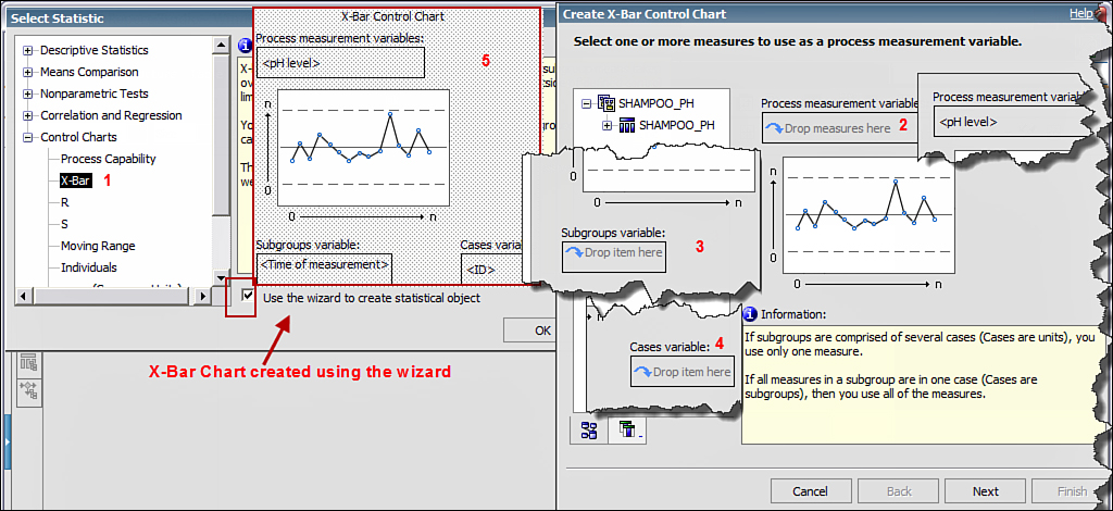
Figure 10.39. Create Statistical object using the wizard.
When you choose the Statistics option, the Select Statistics window enables you to choose from one of the five categories to build the Statistical object. You can from here proceed to use the wizard-driven option, or you can uncheck the option Use the wizard to create statistical object. The five categories available are as follows:
1. Descriptive Statistics describes different aspects of data. It enables you to create Basic Descriptive Statistics, Histogram, Boxplot, and Q-Q plot. You should first provide one or more measures and then choose statistics to calculate and display.
• Basic Descriptives Statistics is used to describe the main features of a data set in quantitative terms.
• Histogram is generally used to display the range of variable values in equal lengths of interval.
• Boxplot is typically used to show groups of numerical data, such as minimum and maximum values, outlying and extreme values, median values, and so on.
• Q-Q Plot (quantile-quantile) is typically used to chart the quantiles of a variable’s distribution against a distribution of your choice, including normal distribution.
2. Means Comparison is an appropriate choice when you need to test for significant differences between group means in the data that is normally distributed. It enables you to determine if the means comparison observed in the sample can be generalized.
• One-Sample t-Test is used to test if the mean of the variable differs from a specified test value.
• One-Way ANOVA is used to assess if the groups of means differ significantly.
3. Nonparametric Tests is an appropriate choice when you need to test for significant differences between frequencies when the data may not be normally distributed. These tests enable you to determine if the frequency differences found in the sample can be generalized to the rest of the data.
• One-Way Chi-Square Test is used to compare the observed frequencies against expected frequencies using data from single categorical variable.
• Two-Way Chi-Square Test is used to compare the observed frequencies against expected frequencies using data from two categorical variables.
4. Correlation and Regression is an appropriate choice when you need to understand the relationship between associated variables.
• Basic Correlation measures the association between two variables that helps understand the relationship.
• Linear Regression is used to display the regression coefficients of the linear equation involving one or more independent variables that best predict the value of the dependent variable.
• Curve Estimation is used to plot a curve through a set of points to examine the relationship between one independent variable and one or more dependent variables.
5. Control Charts is an appropriate choice when you need to work with a statistical process control chart to assess the consistency of process measures over time and highlight measures that are outside of the defined control limits.
• Process Capability is used to plot the distribution of measurement subgroup means taken over time.
• X-bar is used to chart variable data where the sample size is made up of several measurements. This is typically used with an R-chart and S-chart.
• R is used to chart variable data where the sample size is made up of several measurements. It is used to plot range values where the smallest value in a subgroup is subtracted from the largest value in the same subgroup. The mean of the ranges of all the subgroups is represented by the center line.
• S is used to chart variable data where the sample size is made up of several measurements. It plots the standard deviation of each subgroup. The mean of the standard deviations of all the subgroups is represented by the center line.
• Moving Range is used to chart variable data where the sample size is a single measurement. It plots the absolute value of the difference between the minimum and maximum values of the measurements for n consecutive cases, where n is defined by the span. The average change from one sample to another is represented by the center line.
• Individuals are used to chart variable data where the sample size is a single measurement. This plots the measured value of each individual sample. The average of all individual samples in the chart is represented by the center line.
• p, np (Cases are Units) is used to plot attributes of the data where you track whole units that are defective. You should use p charts to plot the percent of units that have defects based on samples of equal or unequal size. Use an np chart to plot the quantity of units that have defects based on samples of equal size. In this option each case is a unit with a subgroup identifier.
• p, np (Cases are Subgroups) is used to plot attributes of the data where you track whole units that are defective. You should use p charts to plot the percentage of units that have defects based on samples of equal or unequal size. Use an np chart to plot the quantity of units that have defects based on samples of equal size. In this option each case is a subgroup, and there are as many variables as individuals within the sample.
• c, u (Cases are Units) is used to plot attributes of the data where the number of defects per unit is tracked. The c charts are used to plot the total quantity of defects based on samples of equal size. The u charts are used to plot the defects per unit based on samples of equal or unequal size. In this option each case is a unit with a subgroup identifier.
• c, u (Cases are Subgroups) is used to plot attributes of the data where the number of defects per unit is tracked. The c charts are used to plot the total quantity of defects based on samples of equal size. Theu charts are used to plot the defects per unit based on samples of equal or unequal size. In this option each case is a subgroup, and there are as many variables as individuals within the sample.
IN A NUTSHELL: REVIEWING BY IBM COGNOS BI AUDIENCE
Depending on your role in IBM Cognos BI project implementation, you may be interested to know those aspects of using IBM Cognos Report Studio that relate to your role on the project. The following points review IBM Cognos Report Studio by role at a high level.
Architect Perspective
Architects are interested to know the capabilities of the product, so they can appropriately recommend a tool/component for the overall BI implementation along with the impact it can have on the architecture, performance, and scaling as the project progresses. Report Studio is a core component of IBM Cognos BI and is installed with the Cognos BI install. Some of the key points that you may want answered early are:
• Report Studio is an advanced and complex report authoring tool for Cognos Report Studio report authors/developers.
• Report Studio can be used for report development as soon as the Framework Manager metadata package has been published to IBM Cognos Connection.
• It uses the existing IBM Cognos BI security and data sources already defined in the IBM Cognos BI environment.
• If the Cognos reporting solution requires building statistical reports, you need to install IBM Cognos Statistics and integrate it with IBM Cognos BI. After this is done, the Statistics option shows in IBM Cognos Report Studio.
• The performance of the reports can be enhanced by choosing an appropriate Cognos install strategy, that is, distributed install with components on the Gateway. For example, you may want to consider configuring the dispatchers together with the Gateways.
Project Manager Perspective
Project Managers are interested in knowing if Report Studio has been identified and recommended as part of the IBM Cognos BI solution. If it will be used, what are the related tasks, skills, and resources required to implement the tasks and what phase do these belong to? Here are some points to consider:
• Report Studio is a report development tool suited for report developers. It is a sophisticated tool that enables building complex reports and dashboards-style reports.
• To build Report Studio reports, the resource must have knowledge of Report Studio.
• Report Studio is an advanced report development tool, and resources new to Report Studio should consider formal Cognos training for Report Authors.
• Before Report Studio report development can start, the Framework Manager package must be published by the Metadata Modeler. The report author can then use the metadata available in the package to build the reports.
• If the project implementation requires building statistical reports, IBM Cognos Statistics is required in addition to IBM Cognos BI software. After the IBM Cognos Statistics is installed and configured with Cognos BI, the Statistics option will be available to report developers to build statistical reports for users.
• Report Studio is part of the IBM Cognos BI software and does not need to be purchased separately.
Business Analyst Perspective
Business Analysts should be familiar with the features of Report Studio and Cognos Workspace Advanced, so they can guide the end users appropriately. Cognos Workspace Advanced is a subset of Report Studio, and the interface is geared toward advanced business users, whereas Report Studio is used to build simple to complex reporst (for example, multipage, dashboard style, and so on) and is geared toward professional report authors. Some of the key points to consider are:
• Report Studio is a report development component with advanced reporting capabilities. These reports must be prebuilt for end users by the report authors.
• Reports that require a high level of interactivity can be built using the Active Reports option in Report Studio. For more information on Active Reports, refer to Chapter 6, “IBM Cognos Active Report.”
• Carefully consider the various audiences of the BI solution. This can help map the Cognos components best suited for their needs. For example, are there users who need to use External Data capability? Are these users end users or report authors? External Data capability is available from Cognos Workspace Advanced and Report Studio. Your understanding of the audiences and their needs can enable you to help the development team choose the best-suited component.
• Report Studio can be used for building statistical style reports, for example, with Boxplot, Control Charts, and so on. These can be built using the Statistics option in Report Studio, which is available after IBM Cognos Statistics is installed and configured with IBM Cognos BI.
• Recommend Report Studio for static reporting and Active Reports for reports that require interactivity in disconnected mode.
• Report Studio is suited for building multipage, dashboard style reports, drill-through capabilities, enhanced charting options, and varied prompts, for example, single-select, multiselect, and tree-prompts that support hierarchical structures, cascading prompts, and so on.
• Report Studio uses the existing Cognos BI security to hide or show reports available in the Cognos portal. All or selected users can be granted permissions on their ability to schedule the reports. All such requirements where applicable should be gathered and documented.
• Reports with high-volume data can be scheduled or burst to users’ inboxes during off-peak hours. It is recommended that this be discussed with the stakeholders for consideration during requirements gathering sessions.
• Report Studio reporting capabilities enable prompt-based reports where the same report can be used to display content based on user prompt value or user’s security permissions, for example, security based filters on department, country, and so on. All such requirements should be carefully discussed and documented during the requirements gathering phase.
Developer Perspective
Developers here refer to the Cognos development team. Some points to consider for Report Studio implementation are highlighted here:
• Report Studio report performance can be greatly impacted by how it is designed. Ensure you use the best practices to build reports that are efficient.
• With capabilities available in Report Studio, you may merge some already available reports. It is a good idea to review each report carefully and recommend such possibilities where feasible.
• There may be situations in which it may be worth considering working with a report view rather than creating a slight variation of an existing report, for example, the same report with different schedules, language, and so on.
• Appropriate drill-through reports exist and have the required permissions for user access.
• Consider using Report Studio to enhance Cognos Workspace Advanced reports.
• Consider creating a data mapping document for each report that captures data availability for each report element, its mapping to the back-end tables, and applicable business rules.
End User Perspective
End Users refers to business users and business analysts who will be using Report Studio reports to analyze their data. Some of the things you should think about are listed here:
• Report Studio reports are static in nature; however, you can have different options that enable you to provide an input to specify the data to be displayed in the report. For example, you can have a Year option that enables you to choose a year value from the drop-down list, Product line for single or multiple select, and so on.
• If you are a legacy Cognos 8.x user now upgrading to IBM Cognos BI v10.x, you can choose to continue displaying the legacy charts as Cognos 8 while the new charts can have Cognos 10 features.
• Report Studio is a sophisticated report building tool and can be used to build simple to highly complex reports like multipage reports or dashboard style reports.
• Report Studio has drill-through capability, which enables users to navigate from one report to another for additional analysis and return back to the previous report without having to hop from one report to the other.
• If the metadata has sensitive information and should not be accessible to all, then you should clearly communicate this requirement. Report Studio has options that enable you to hide/display content in the same report for different user groups, depending upon requirements. For example, the same report may display only nonsensitive information to regular users; however, to a power user or an authorized user, additional sensitive information may also be displayed, all in a single report.
IBM Cognos BI Administrator Perspective
IBM Cognos BI Administrators should guide the team and ensure they use best practices. Although several options are available in Report Studio, some may be more resource-intensive than others. Working with the team to analyze this can help plan for install, performance, and scalability. Some of the points worth considering are:
• Report Studio is accessible to all the users who need access.
• What capabilities should be accessible by the end users?
• For long running reports or those that degrade performance, consider verifying the SQL in use that is available in Report Studio.
• Consider evaluating Query Processing properties to enhance performance.
• Consider setting up advanced dispatcher routing for process-intensive packages.
• Is there any security requirement; for example, who can see the metadata package for data exploration in Report Studio?
Nice post .Keep updating
ReplyDeleteCognos TM1 online Course Bangalore
Very nice Blog with very unique content.
ReplyDeletekeep updating more Blogs on Cognos.
cognos bi training